


About
Having spent a span of five years as a journalist, my professional journey found me engaged with some of the industry's foremost names, particularly the distinguished platforms of The New York Times (NYT) and CNN. During that time, I developed a daily ritual of perusing their websites, which served as my primary sources of information. These media giants, renowned for their authoritative coverage, have remained integral to my media consumption habits, even in the present. My enduring engagement extends to their Twitter accounts, where I continue to glean the latest updates, with a pronounced affinity for the offerings of The New York Times.
My connection to The New York Times runs deep, with a particular fondness for its Opinion section and its unceasing reports on globally significant topics. However, in the course of my browsing experience on the NYT's website, I couldn't help but notice certain areas that appeared to be lacking in optimal design. It is this observation that has sparked my aspiration to undertake a redesign of its user interface. My objective in doing so is to furnish the readership with an interface that exudes intuitiveness and tidiness, enhancing their overall engagement and experience.
The Problem
Small Text In Navigation and Unclear Bar Behavior
Navigation text appears small, with a 0.75 rem font size in the menu header. While the search bar disappears when users scroll, and it's unclear where to input on the search results page.
Wasted Space and Obscurity Direction
The sidebar consumes excessive space, particularly in the section and article pages where it only displays a minimal amount of information. Information direction lacks clarity. While the homepage contains numerous articles and information, some lack clear categorization.
Content Display and Visual Appeal
The content display needs moderation. Each section page follows major news with the latest news and search areas. Presenting over 30 latest news items elongates the page unnecessarily. Content feels condensed with insufficient visual allure. Both the homepage and search result page emphasize content but diminish the media component, resulting in a loss of visual appeal.
Lack of Subscription Engagement
While the New York Times aims to encourage subscriptions, alternative engagement opportunities beyond the subscribe button in the header are lacking.
Goal
My goal with this case study is to provide users with a smooth experience as they move between different sections. Additionally, I aim to make the most of the unused space in the sidebar. At the same time, I want to simplify the content and reduce any unnecessary repetition on the homepage. Given that user subscriptions are a vital source of revenue for the NYT, I'm also focused on improving the chances for subscription engagement as a key objective.
UI Kit
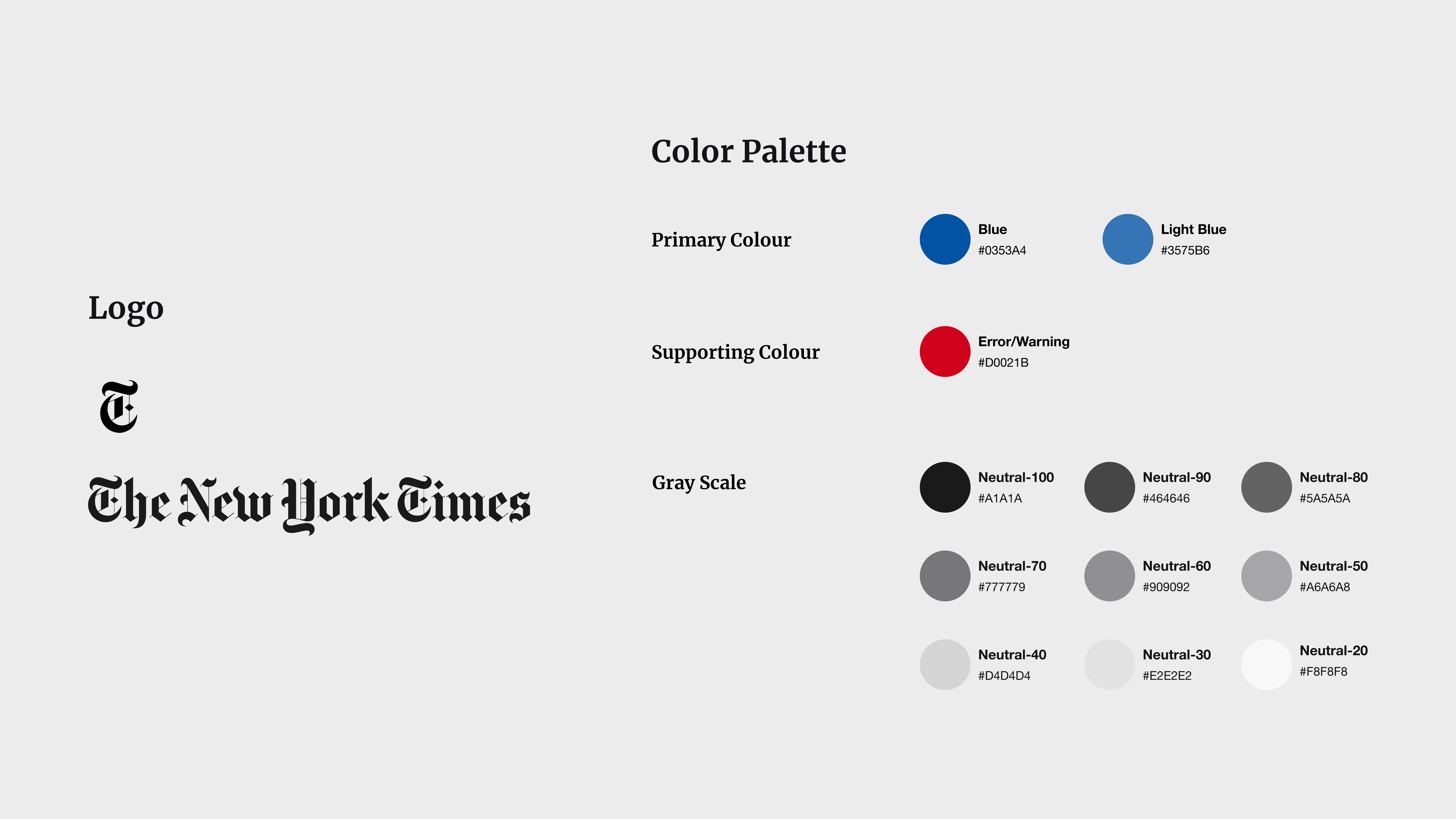
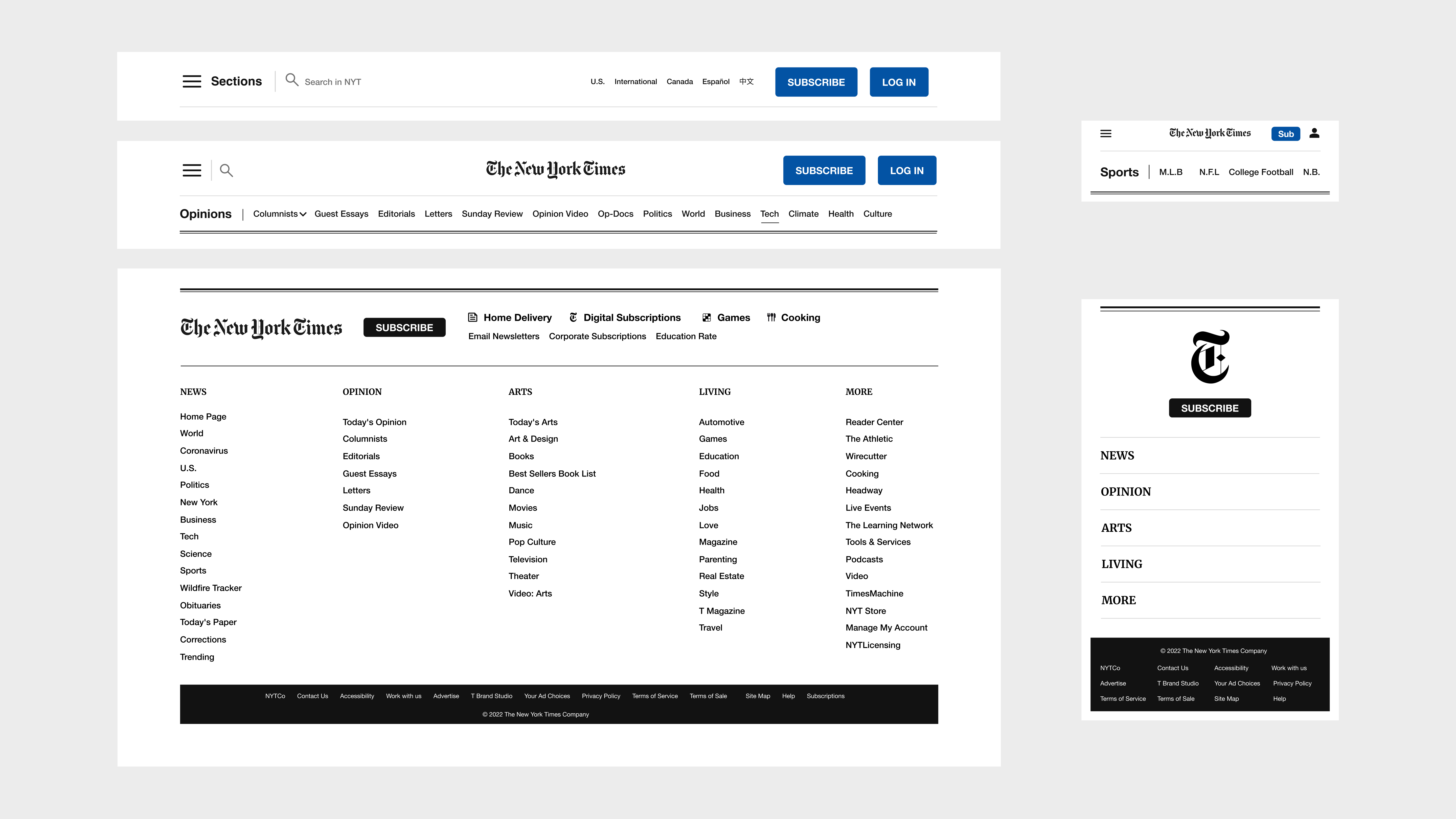
The New York Times website boasts a pristine and professional aesthetic, aligning perfectly with its intended tone, thereby projecting a trustworthy impression upon its readers. Personally, I find this design appealing and have therefore retained its essence. While modifying the user interface (UI), I exercised subtlety in my adjustments. One such refinement was transitioning the footer's hue from white to black, a change that not only enhances contrast but also brings about visual equilibrium throughout the page. Moreover, I opted to replace the prior greyish blue tones of the ACT buttons with two more vibrant shades of blue, both for buttons and mobile icons. The selection of a deep blue shade for buttons was deliberate, as it exudes a tranquil aura while also directing focus effectively within content-rich pages. This meticulous approach maintains the website's dignified appearance while introducing subtle enhancements for an elevated user experience.
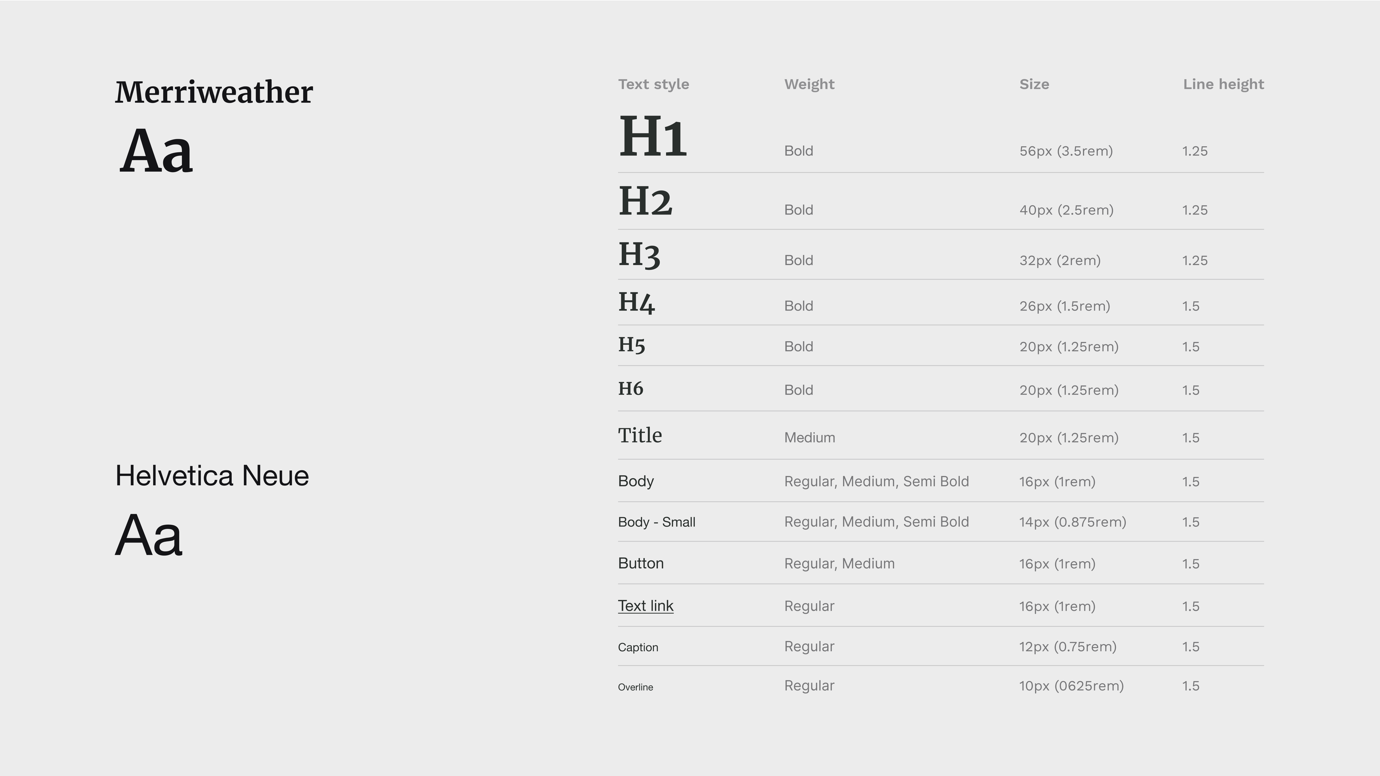
Typography
I choose "Marope" as the heading and title to enhance the app's contemporary, minimalist, and chic aesthetic. For the body text, I opted for "Jakarta Sans" due to its outstanding readability. While unobtrusive, its tone has the potential to imbue other elements and the overall composition with expressive qualities.
Branding
Since this redesign isn't directly linked to branding, I have preserved the brand logo and theme color palette in their original state. However, I've incorporated a range of subtle grey shades that contribute depth and sophistication to the overall design.
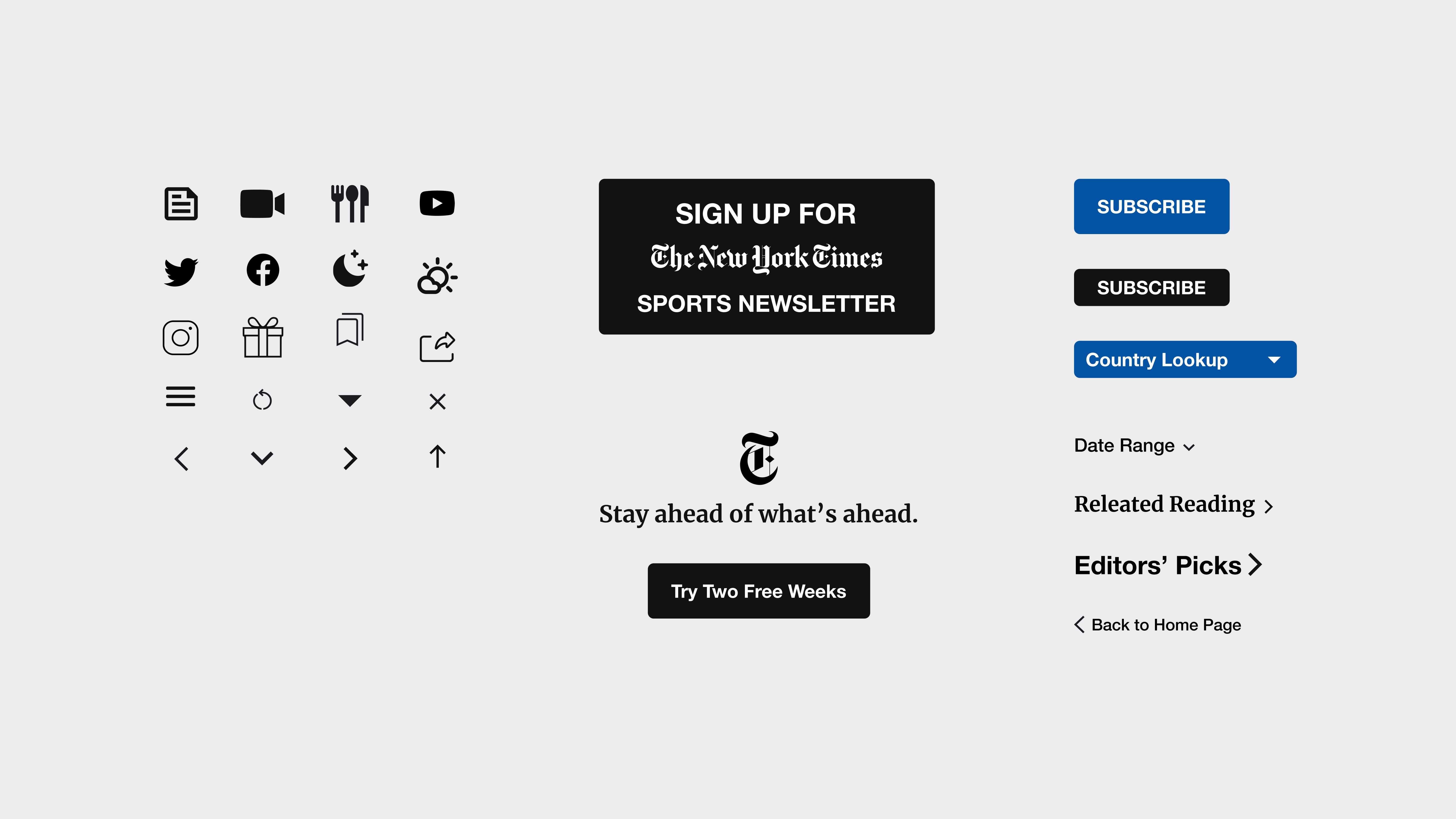
Iconography and UI Components
Update needed
UI Components-Header and Footer
UI Components-Cards
Key Screen Comparison
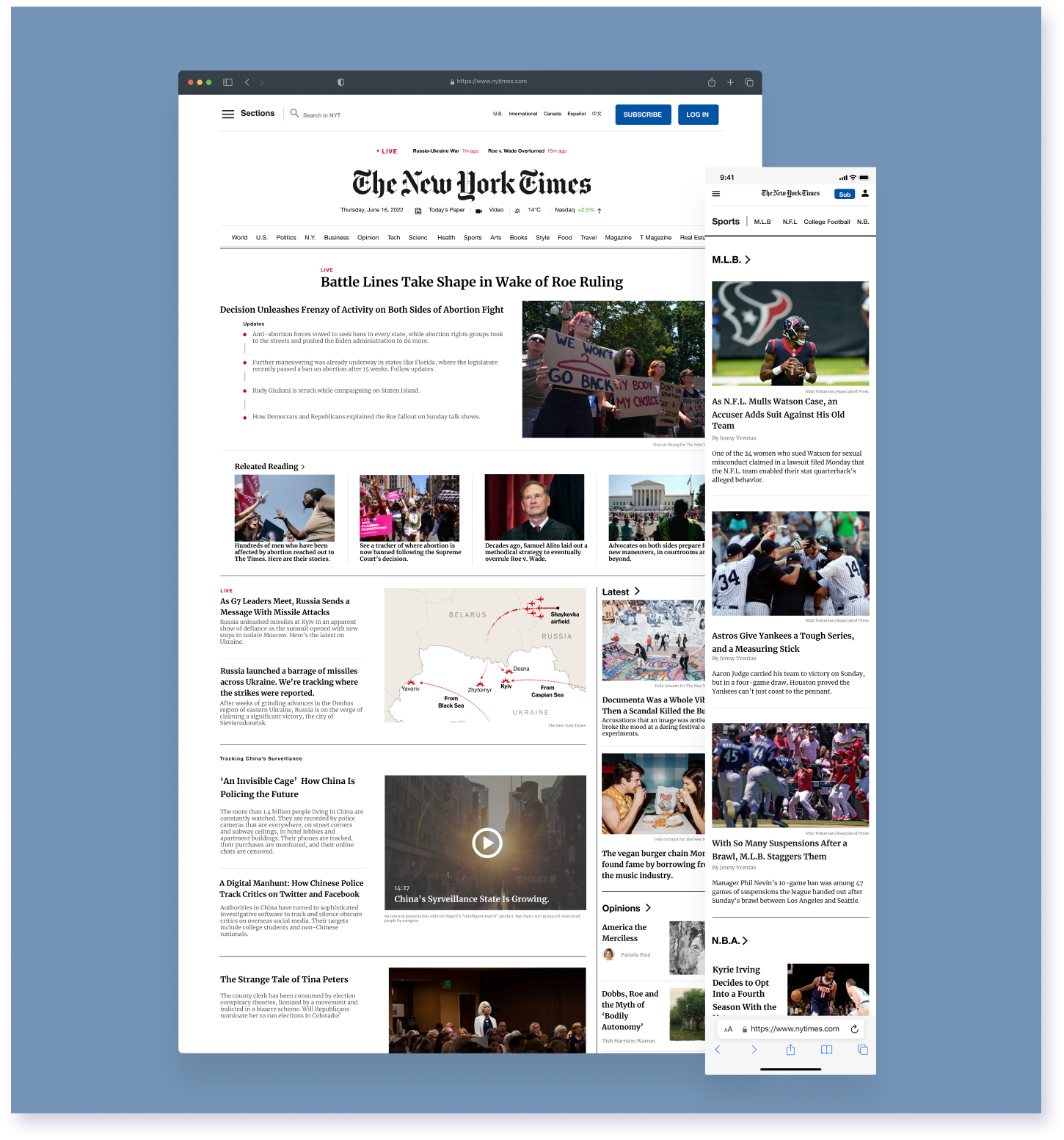
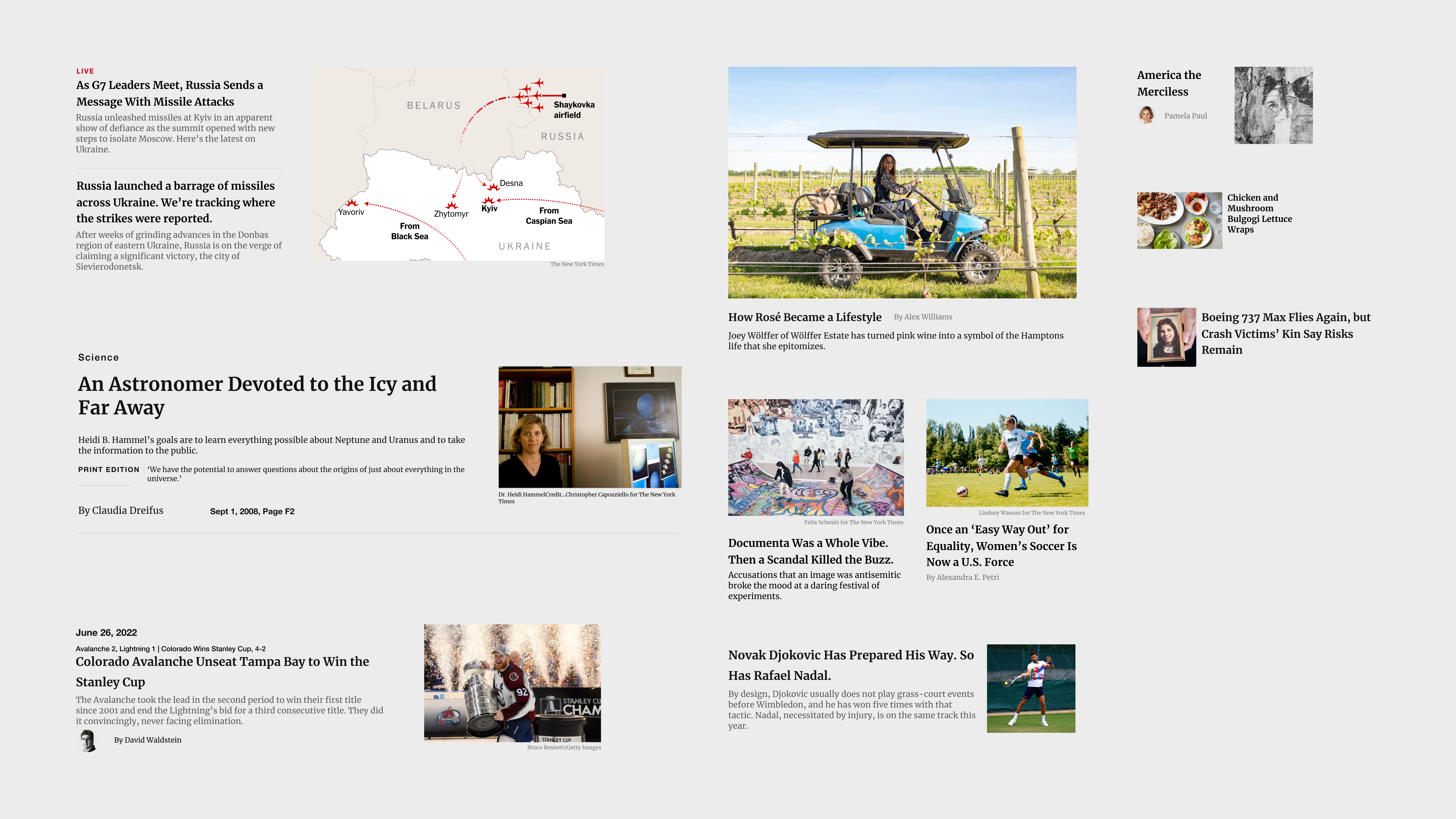
Home
I enhanced the header space, elevated the font size within the menu, and affixed the header section to the top, granting users convenience in section navigation. Color differentiation aids in distinguishing information—red signifies "Live" status and start times, while green highlights stocks. Furthermore, I amplified the prominence of the subscription and sign-in buttons, employing an Egyptian blue shade to draw user attention. Within the sections, I restructured the arrangement, eliminating redundant segments and enlarging image dimensions. Beneath the game section, I introduced an additional subscription button, and prior to the footer, I integrated another, both of which contribute to an enhanced subscription experience.
Section
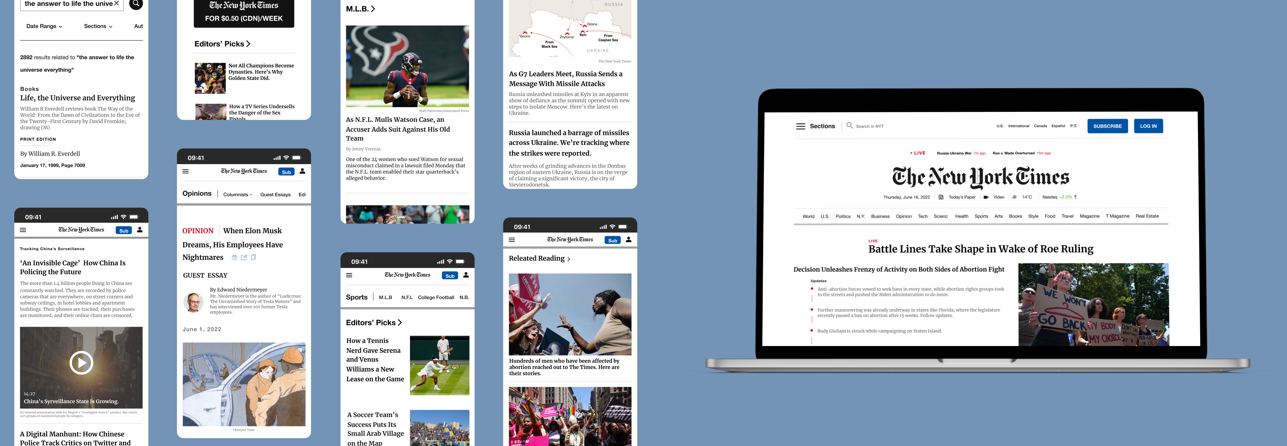
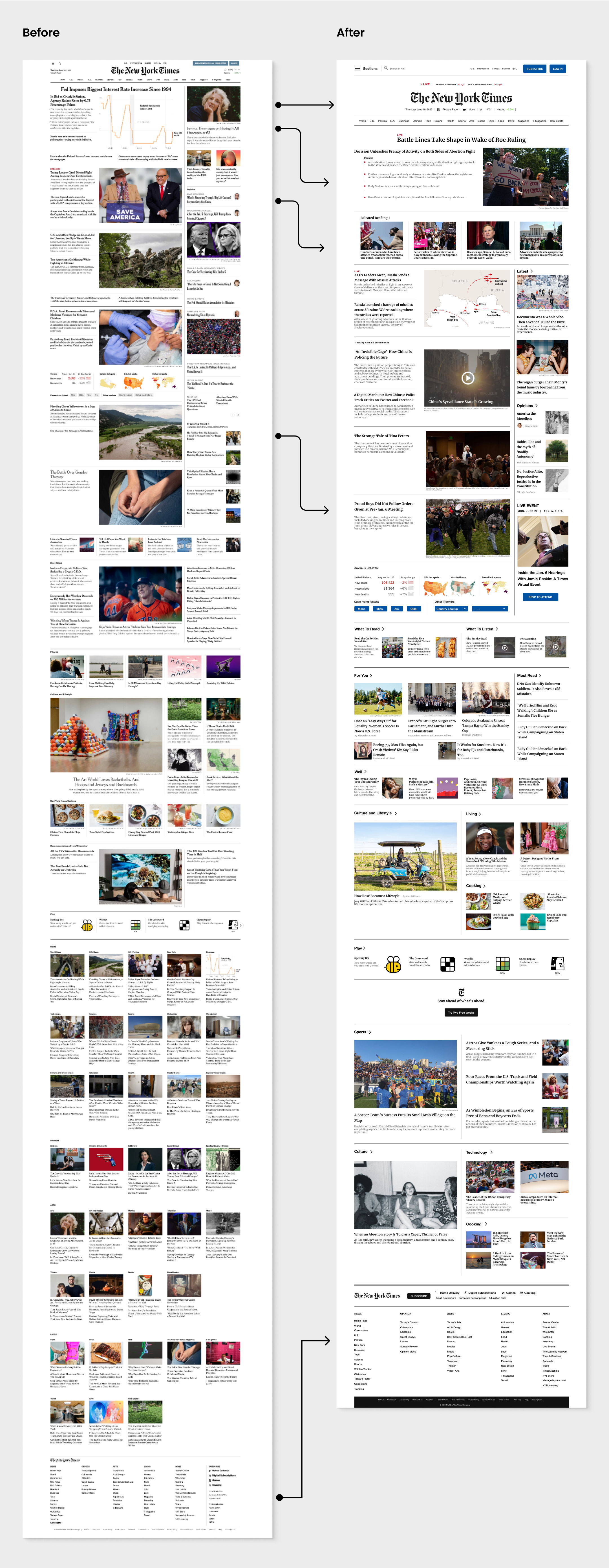
The primary issue with the section page pertains to the overwhelming presence of "featured" content, resulting in excessive page length and hindering users in locating their desired articles. To address this, I undertook a category revamp, prioritizing visibility for trending topics. Additionally, I introduced a prominent scoreboard and registration section within the right-hand column. To enhance user experience, I incorporated a "Back to Homepage" button and a "Show More" option at the page's conclusion.
Article
My primary objective for enhancement centers around optimizing the utilization of page space. At present, both the left and right margins of the page remain underutilized. To address this, I've undertaken a division of the entire page into two distinct sections. The dominant portion, situated on the left side, is dedicated to articles, while the right column houses supplementary content, comprising relevant articles and topics within the same section. This strategic restructuring not only makes efficient use of the available space but also enhances the accessibility and engagement for users browsing the page.
Search
The search bar on the search results page disrupts the overall visual equilibrium, compounded by the issue of text truncation when users input lengthy queries. To address this, I've reintroduced a conventional search field to the page. Additionally, I've widened the gaps between each search result, serving the dual purpose of enhancing readability and providing the page with a contemporary and polished appearance. This thoughtful redesign ensures both visual harmony and improved usability, contributing to a more user-friendly and aesthetically pleasing search experience.
New Mobile Screen
Reflections
Indeed, this website has proven to be a substantial challenge for me to tackle. Over time, I've become intimately familiar with its various iterations, which have served as invaluable references in my design work. Despite this, I believe there's room for it to better align with current design trends while preserving its inherent characteristics.
Navigating this intricate process involves harmonizing its established traits with modern design sensibilities. Managing this balance presents a noteworthy endeavor. Considering the website's considerable volume of content, it prompts me to contemplate the judicious utilization of space to effectively communicate hierarchy to readers. This challenge is particularly pertinent for websites of this nature.
Furthermore, transitioning to the realm of practical implementation, updating a website's UI while retaining its brand essence and ingrained user behaviors poses a substantial conundrum. Striking this balance while simultaneously offering a refreshed appearance is no simple task.
This case study encapsulates my response to these challenges at this point in time, and I find myself content with the outcome. Yet, I aspire to exhibit greater audacity in my future endeavors, creating visuals that are not only captivating but also distinctively differentiating.
Note:
Taking a look back at this redesign, I've picked up on several spots that could use some polishing – things like icon inconsistency and buttons having different margins. It reminds me the importance of details.