


About
Who isn't a fan of Costco? It consistently delivers value with its reasonable prices and superior quality. Regrettably, this delightful in-store shopping experience dissipates upon engaging with its app.
I am far from alone in this sentiment.
A sentiment shared by many is summed up brilliantly: “It’s not so much an app as it is a web wrapper.” This succinctly elucidates the numerous issues plaguing the Costco app, including overwhelming clutter on pages, disjointed navigation hindering seamless backtrack, and the irksome need for recurrent membership logins.
It's plausible that Costco follows a business strategy favoring in-person shopping. Nevertheless, it's incumbent upon any company to ensure a positive user experience for all clientele, whether their preferences lean towards offline or online purchasing. Particularly for warehouse clubs like Costco, boasting a substantial consumer base and a membership structure, digital platforms can offer unparalleled convenience.
As a result, I opted to undertake a redesign, striving to enhance the experience in any conceivable manner.
Background
According to the description by the Business Inside, the typical shoppers of Costco is between 35-44 year old married Asian American women with a university education and earn over 125,000USD a year. A more general survey conducted by Morgan Stanley in 2020 said that Costco members have an average annual income of 93,000USD, and its membership renewal rate is about 88%.
In Costco you have to buy bulk and that also explains why the majority of Costco stores are located in affluent suburban areas around the world. Most Costco shoppers are suburban homeowners. It takes a lot of space to store bulk purchases. So a more precise profile is like middle-aged consumer live in a big house with lots of disposable income.
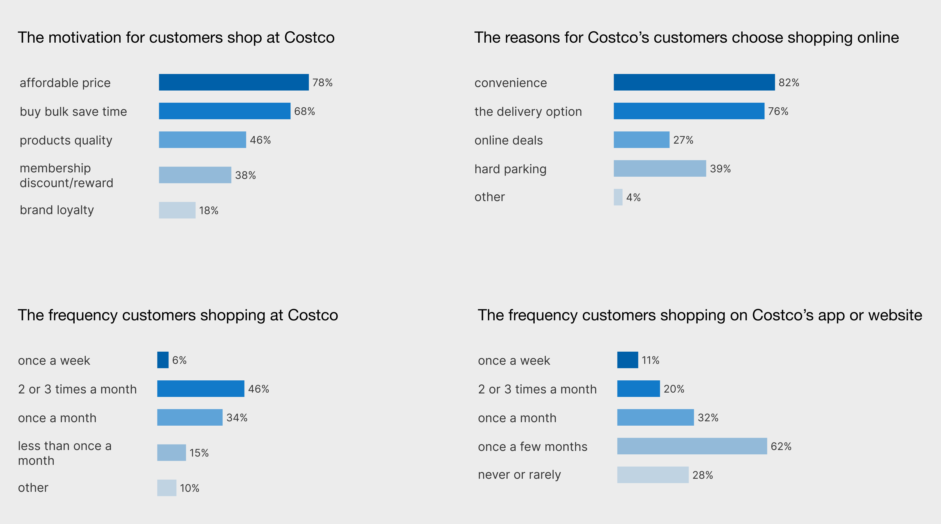
In order to further understand user motivation and behavior, I conducted an online survey.
Research
The 35-44 age range constitutes the largest portion of participants at 48%, trailed by the 25-34 bracket at 32% and the 18-24 group at 9%. In terms of gender distribution, 58% identified as female, while 42% identified as male. The survey inquired about participants' shopping habits and their experiences shopping at Costco.
The Problem
To create a better understanding of the problem, I sifted through hundreds of reviews on the App Store and gathered a few key complaints about the item navigation and selection as the basis for my redesign.
Difficult Navigate and Locate Products
It is difficult to navigate back to an item category once an item is selected. Also, finding out if an item is available at a warehouse or online is difficult since it is not information that is immediately visible to the user.
My List and Shopping Cart
Making shopping lists require you to log-in and it is difficult to access once they are made. The same thing also appears in removing items from the shopping cart.
Poorly Organised Category and Item Filter
People who want to find product types without typing in the search bar are having a tough time understanding how the Costco app is organized. Multiple departments overlap, some sub-menus don't have a clear order, and some categories would work better as filters.
Goal
I hold the view that online offerings should seamlessly enhance the traditional brick-and-mortar shopping experience. My aim was twofold: to establish an effective online shopping platform with a more modern and uncluttered aesthetic, and to elevate the overall in-person shopping experience for users.
The Solution
To enhance the Costco app's usability, I made improvements as following. Introducing arrows to indicate nested menus, reorganizing department categories, and adding a search bar to nested menus.
Additionally, the product filter menu should become an easily accessible tab. The proposal also involves offering category suggestions as users type, refining the search filter to accommodate errors, and highlighting relevant terms. Making the "Add to Cart" and "Add to List" buttons sticky, displaying availability information, merging certain sections, and including a Q&A section are further recommendations. These enhancements aim to address minor yet significant challenges within the app's functionality.
UI Kit
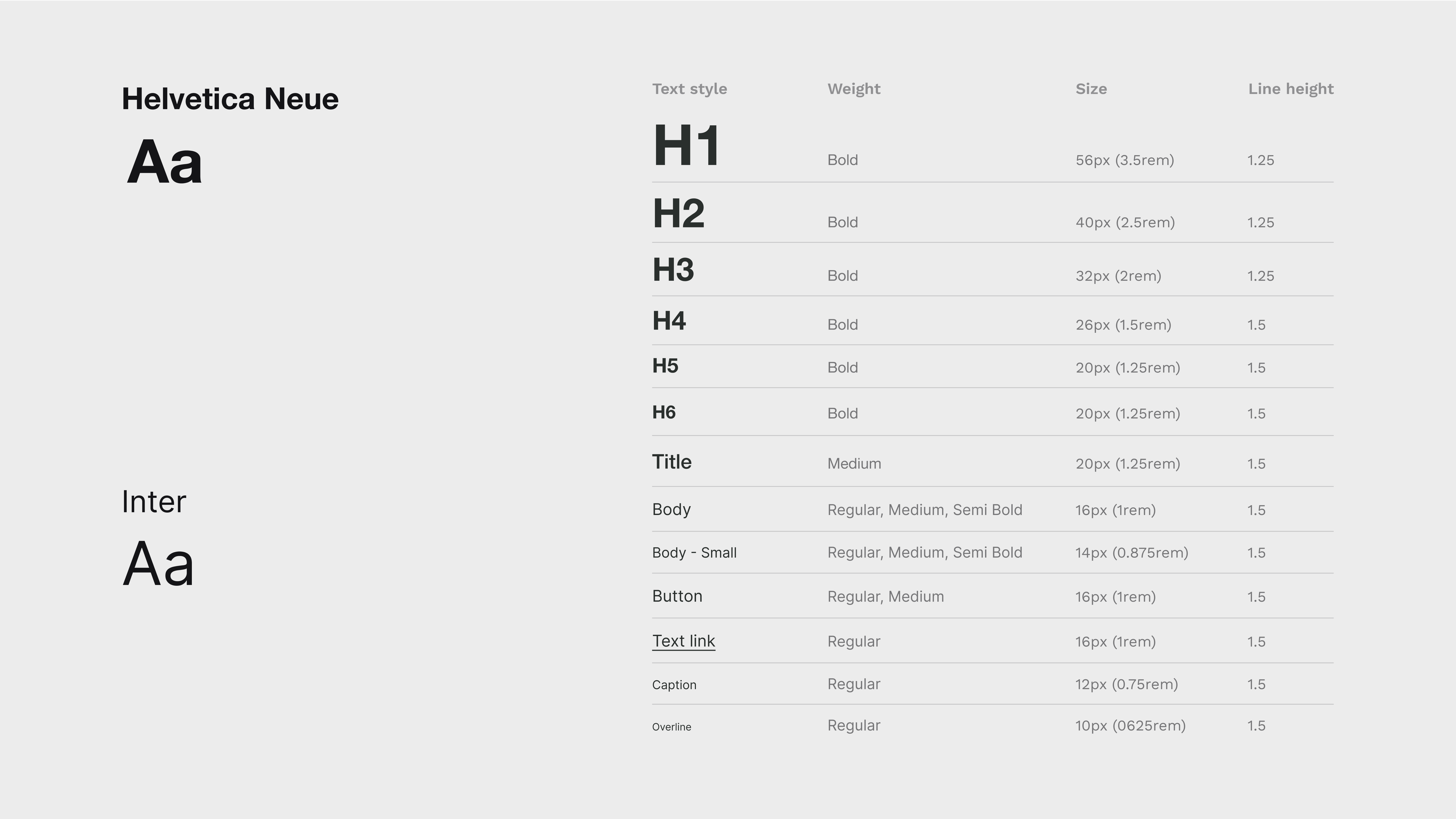
Typography
I chose Helvetica Neue for the heading and title to deliver a modern simple and elegant look, Inter is for body text as it has a good readability.
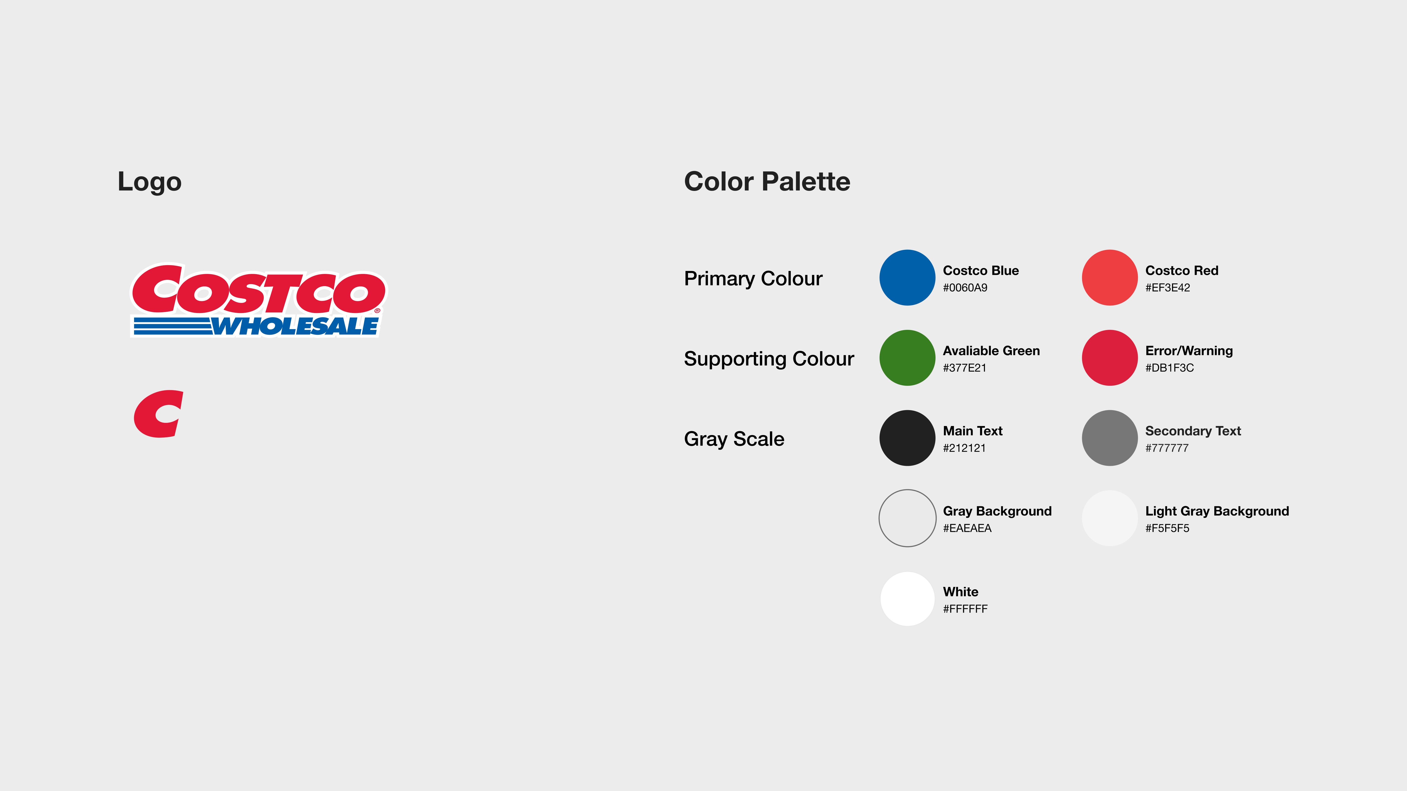
Branding
I kept the signature blue and red for Costco's brand, using them as the main colors in the app as well. But I made the red color even more vibrant to add brightness and happiness. Instead of using blue for the top part of the app, which makes it look unbalanced, I used a light gray for both the top and the bottom parts to make it look modern.
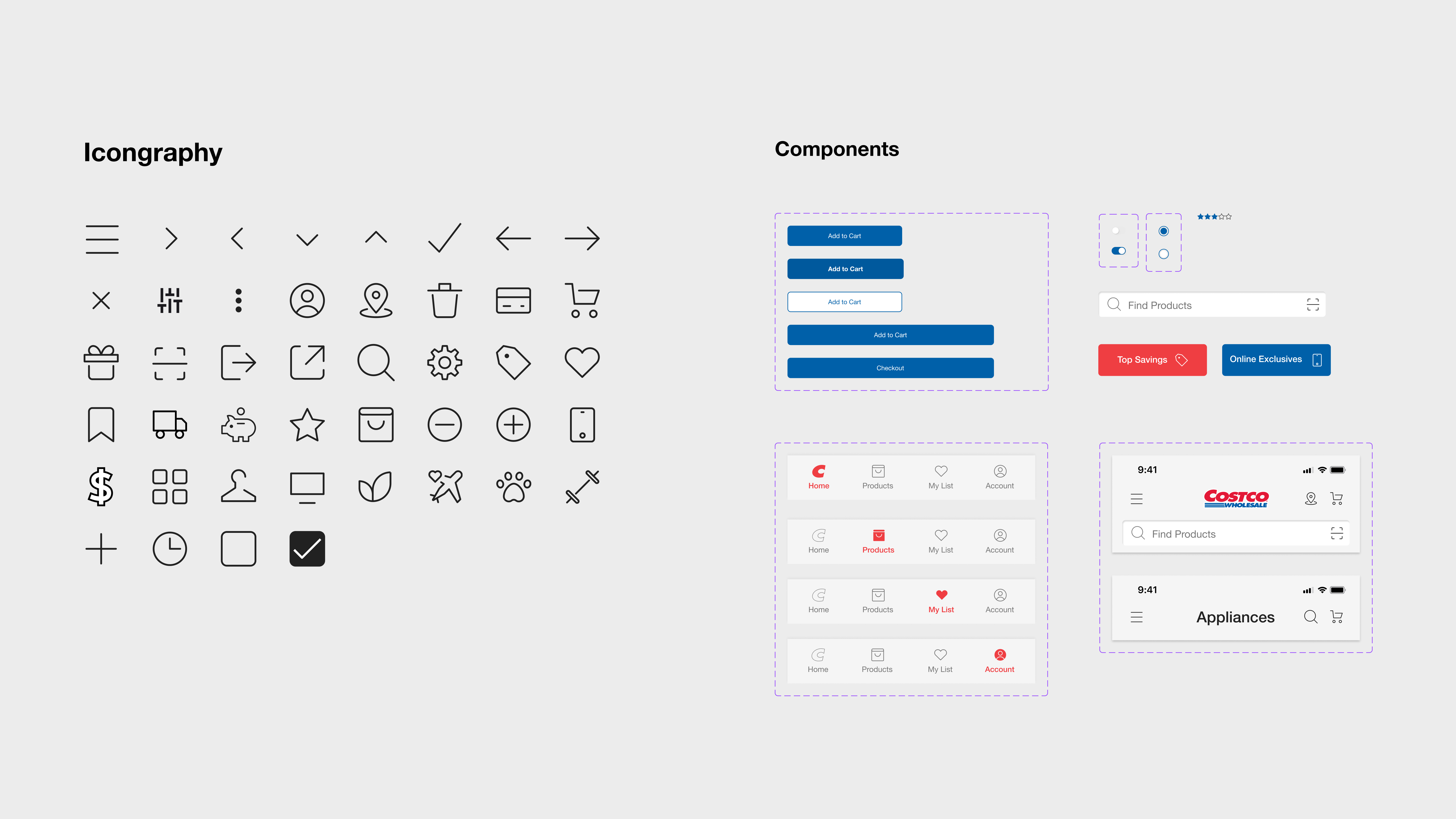
Iconography and UI Components
Outlined icons complements the typography, resulting in a design that is simple and modern. Alongside these elements, the UI components contribute to a user-friendly and welcoming experience.
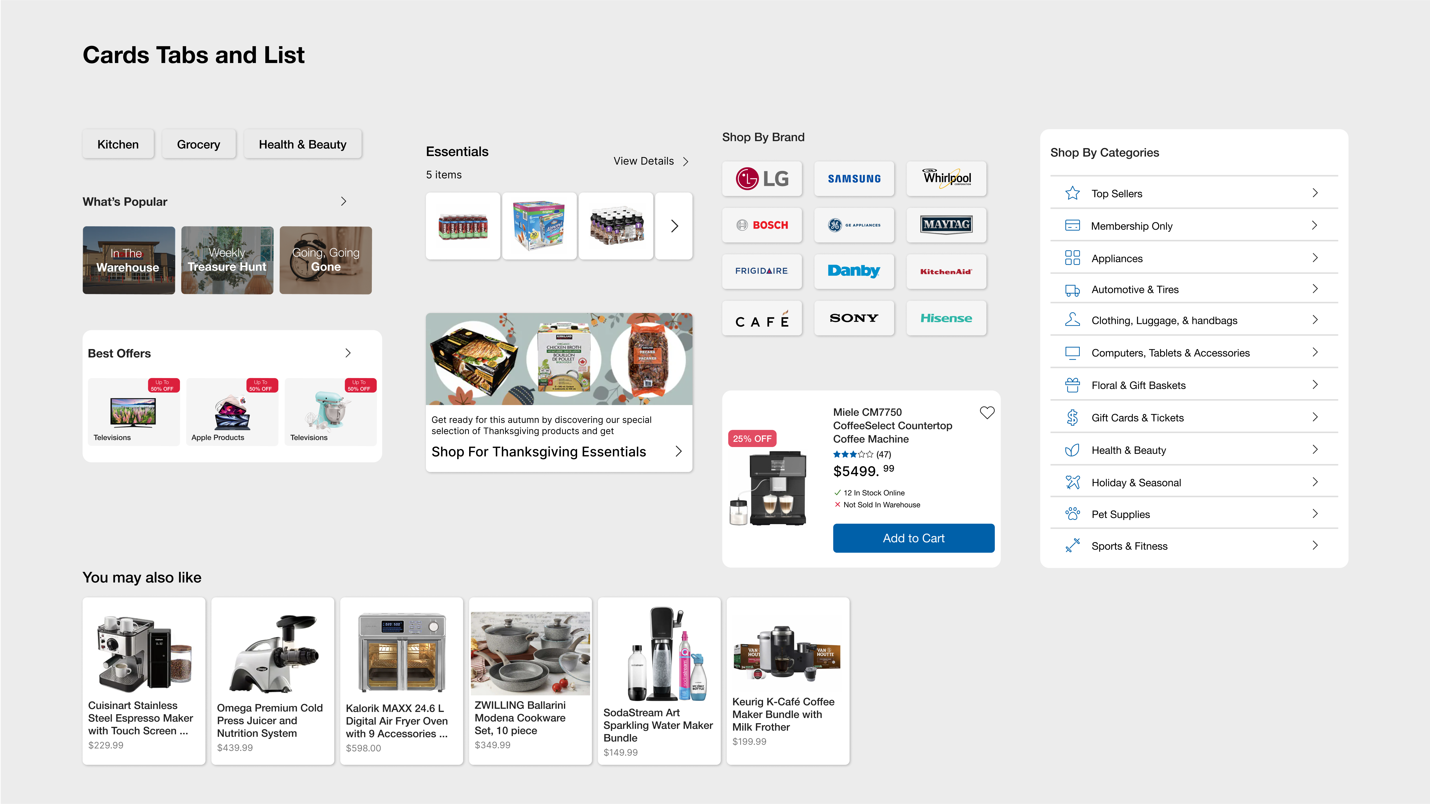
UI Components-Cards/Tabs/List
Different sizes of cards are employed for departments, each featuring titles and icons that offer an intuitive user interface. Tabs, appropriately sized, enhance user convenience for brand-based shopping and optimize space to display more information. The reorganized list, complemented by icons, focuses more on the user's needs.
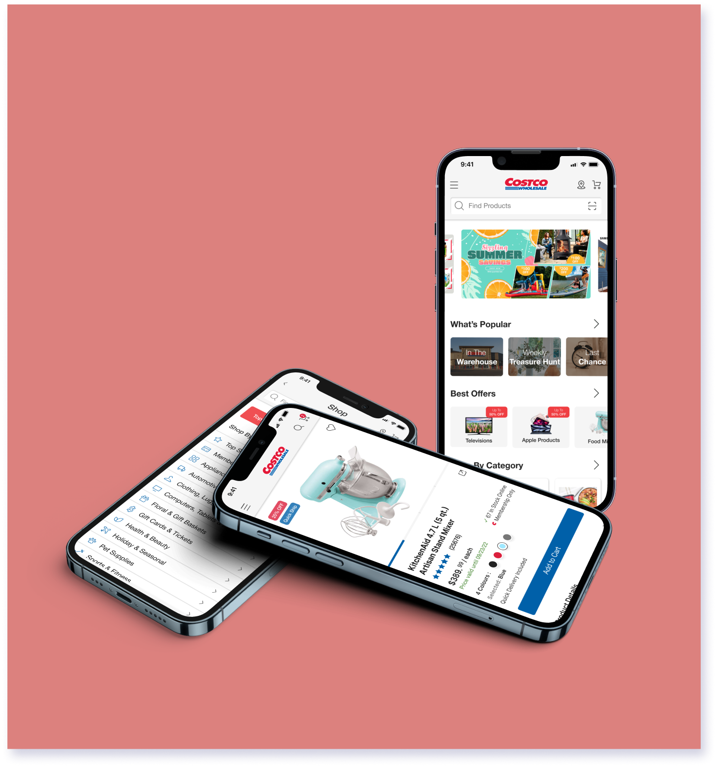
Key Screen Comparison
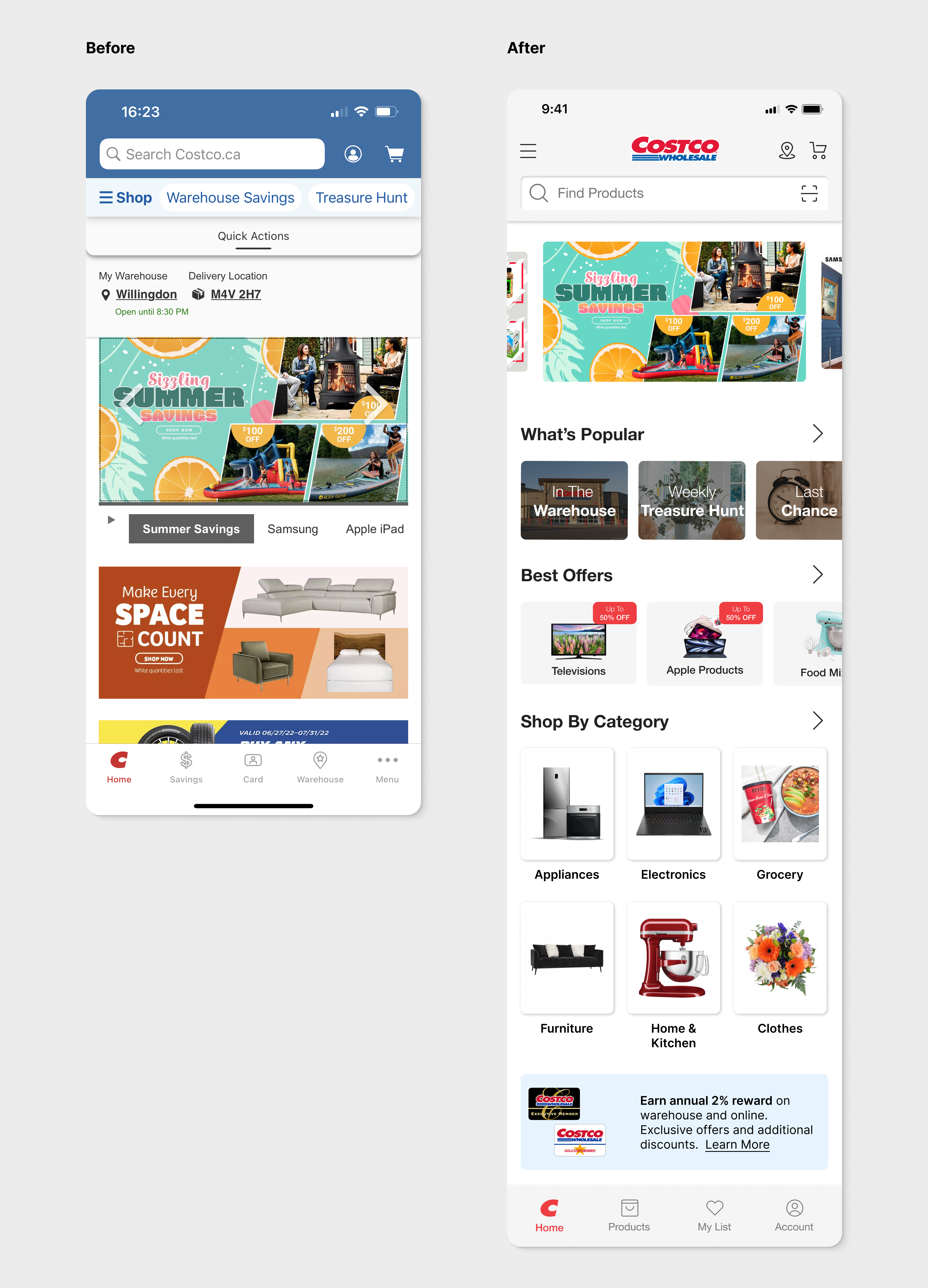
Home
The home screen has undergone a series of improvements. The header's background color was updated for a cleaner look that matches the footer. Additionally, the "My Account" option was moved to the navigation bar, making it more accessible. Notably, a barcode scanner was added to the search field, offering users an extra way to find products.
In the same vein, seasonal promotion posts were completely revamped. Using various image sizes, users are subtly encouraged to scroll horizontally. These posts are now grouped together, saving space while providing more information, resulting in a more spacious page for content.
Navigation has also seen significant changes. The navigation bar entries were reconfigured to prioritize products over membership. Simultaneously, the warehouse location indicator was moved to the upper right corner of the header in a more vibrant red, enhancing visibility for users.
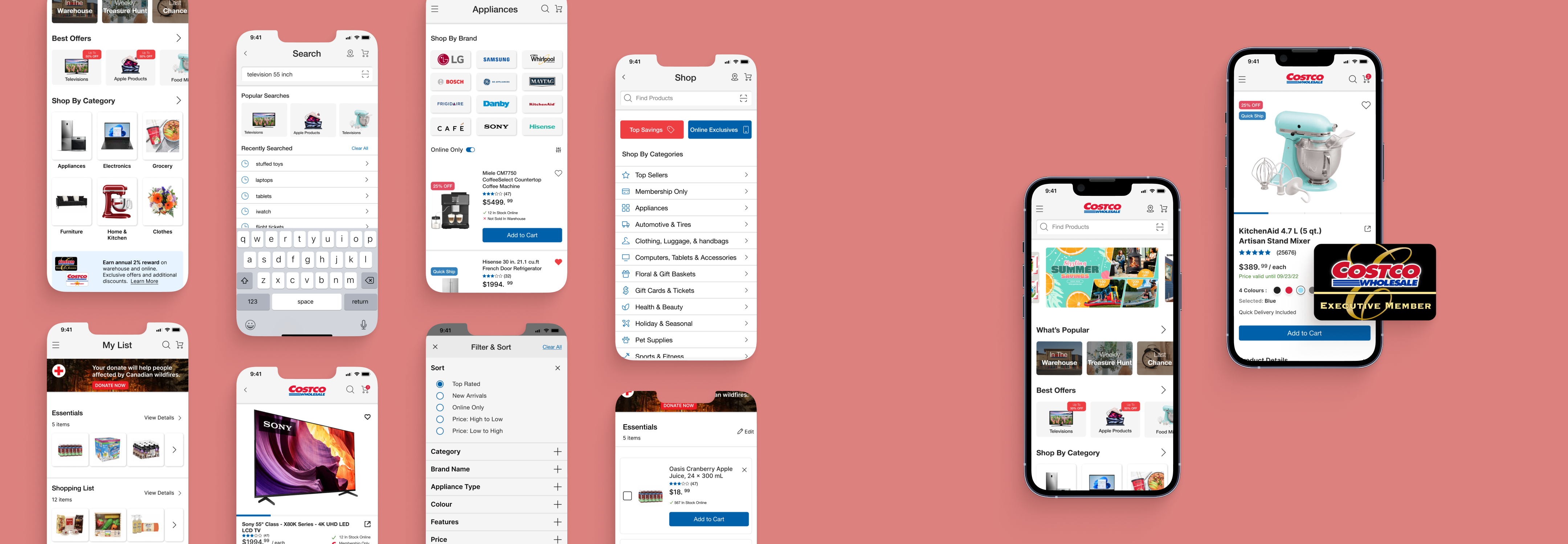
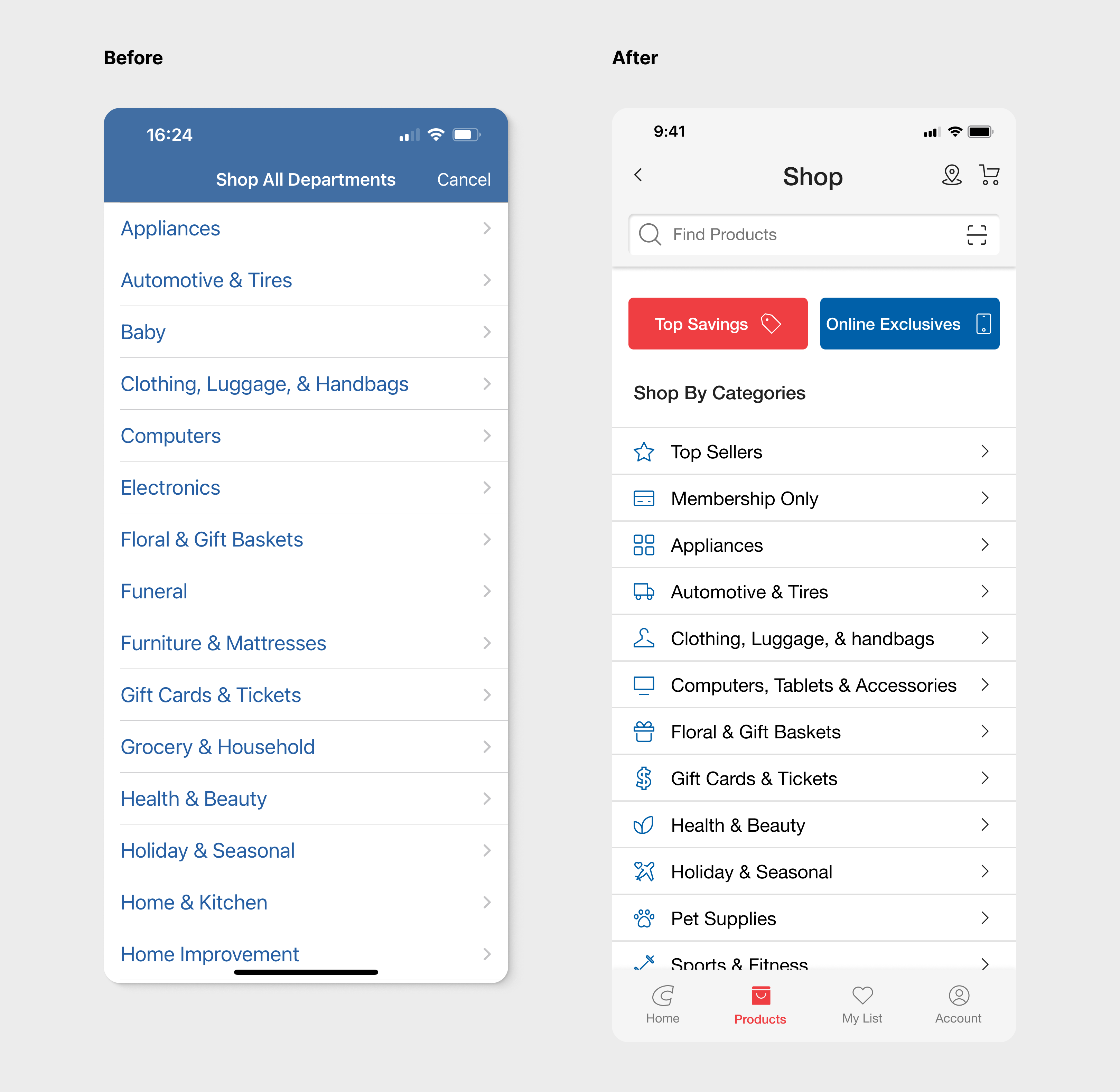
Shop by Categories
Within the Categories screen, I've harmonized the header's background color with that of the products page, creating a seamless and consistent visual experience across the app. Additionally, I've introduced two highly utilized filters, "Top Savings" and "Online Exclusives," offering users expedient access to recently discounted items. Under the "Shop by Categories" section, I've integrated two new choices: "Top Sellers" and "Membership Only" products, augmenting the existing default department categories. A further enhancement involves the inclusion of icons alongside each category, substantially improving visual clarity and text legibility.
In addressing usability, I've reinstated the navigation bar in the Costco stock app. Previously, this feature was absent, necessitating the use of a "Cancel" button in the top right corner to return to the home screen. By reintroducing the navigation bar, users now experience a more streamlined and consistent interaction, significantly reducing the need for additional clicks.
Product List
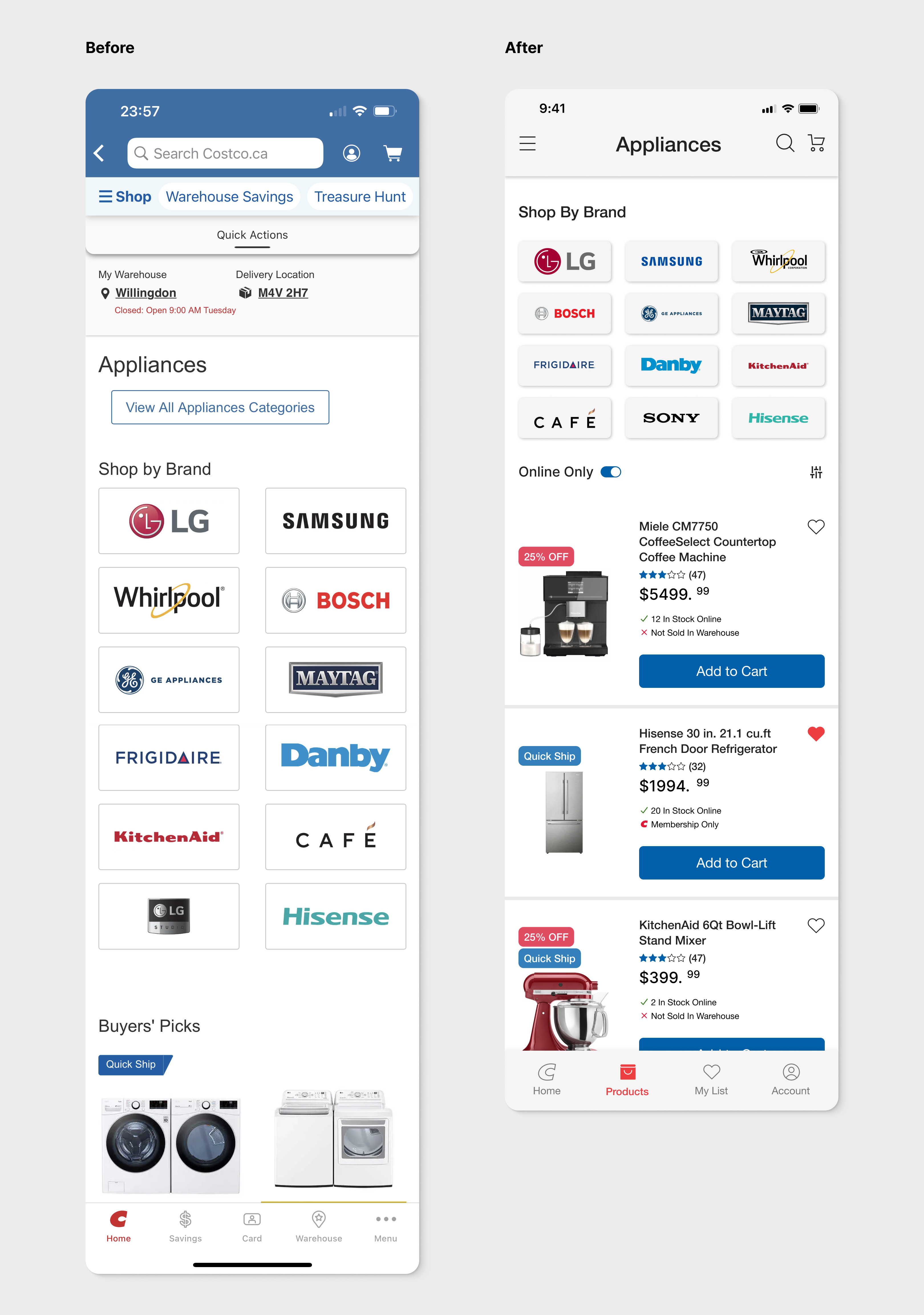
Based on surveys and interviews, participants commended the "Shop by Brand" feature for its effective user-friendly design that expedites product location. However, the display of two brands side by side occupied excessive space, especially on mobile screens. To address this, I optimized it to showcase three icons per row.
Additionally, I switched to a list view for products, providing more comprehensive details like ratings and stock quantities compared to the grid view. Discount information and quick shipping options were strategically placed atop product images, offering users a more streamlined product selection process. Furthermore, an "Online Only" filter option was introduced to swiftly access online exclusives.
Product Detail
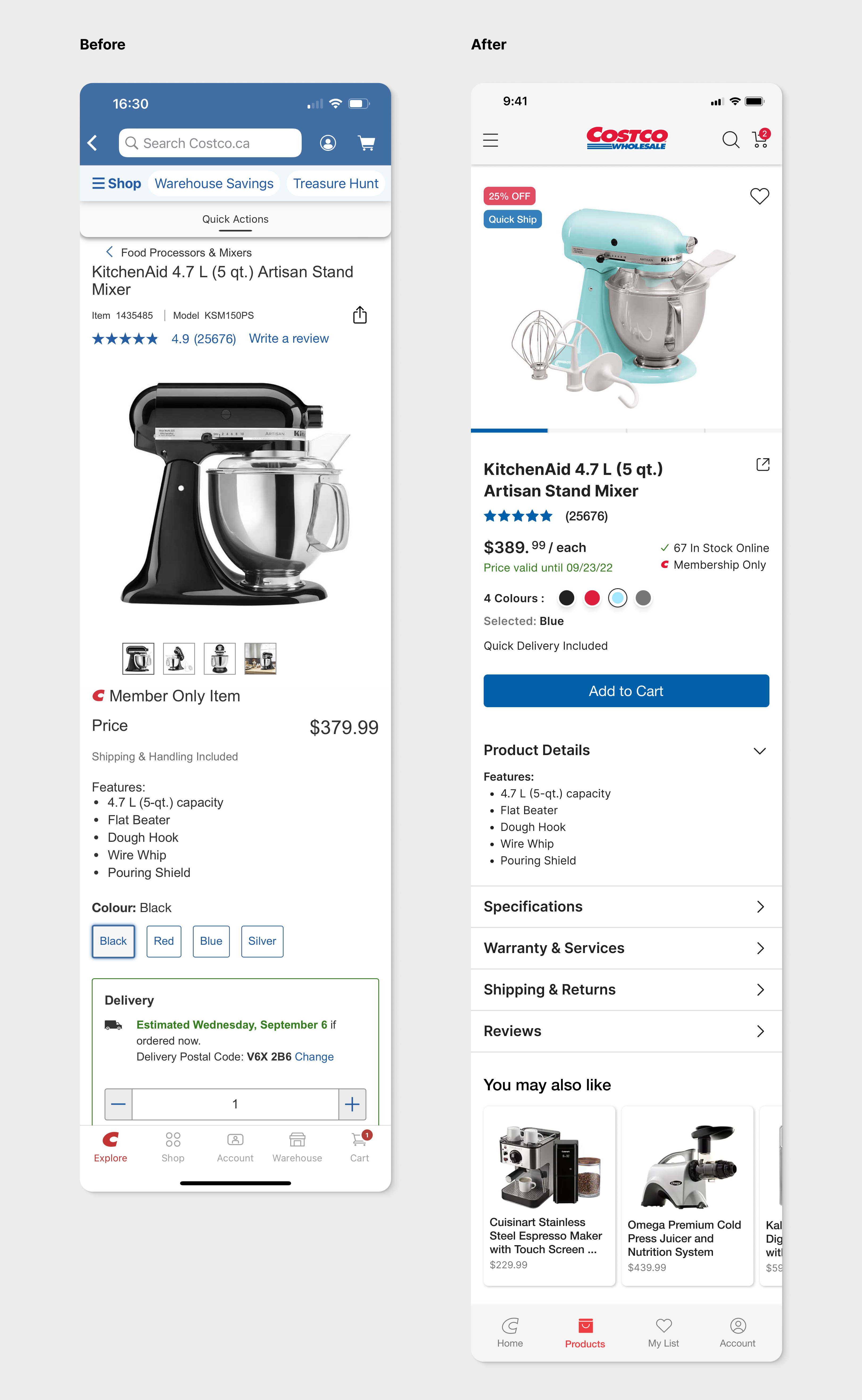
The key focus of this screen is to present product information to users in a streamlined and effective manner. The search bar has been replaced with an icon, and the Costco brand logo now occupies the center of the header. This central position ensures that the brand is visible when users share product details via screenshots. The like button has been reinstated in the upper right corner of product images, providing a consistent method for adding items to wish lists.
Furthermore, the product image has been moved to the top to enhance its visual appeal. Notably, discount and quick shipping details are highlighted with red and blue theme colors in the upper right corner, enhancing the information provided to customers.
Search
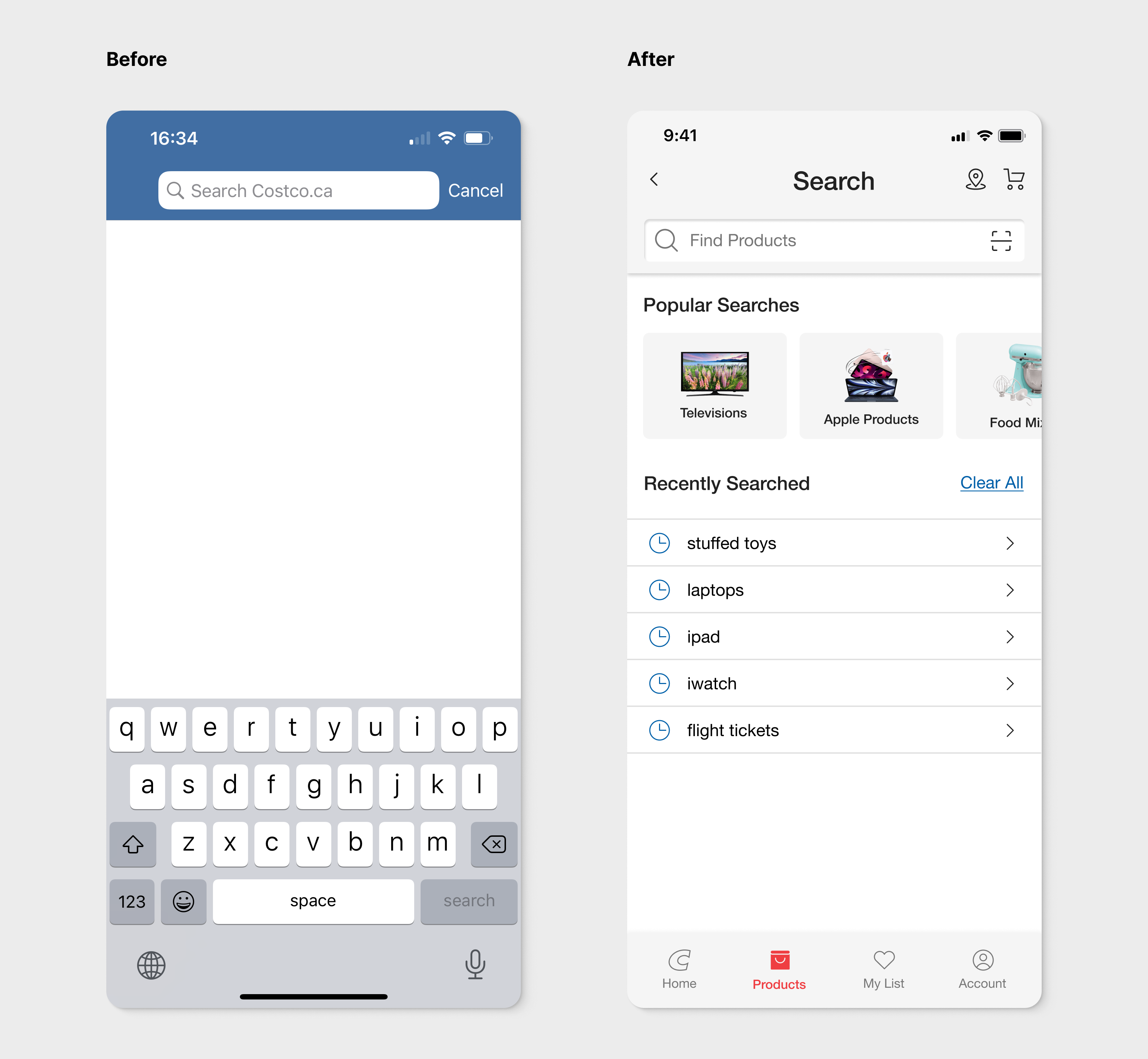
On the search page, the header maintains a consistent theme with other pages, featuring a light background. Moreover, the search input bar has been repositioned lower, accompanied by the inclusion of a barcode scanner option.
To enhance user experience, I've added recent popular search options, eliminating the need for a blank screen. This incorporation of recent search history offers users the convenience of swiftly accessing previously searched products—now just a simple tap away.
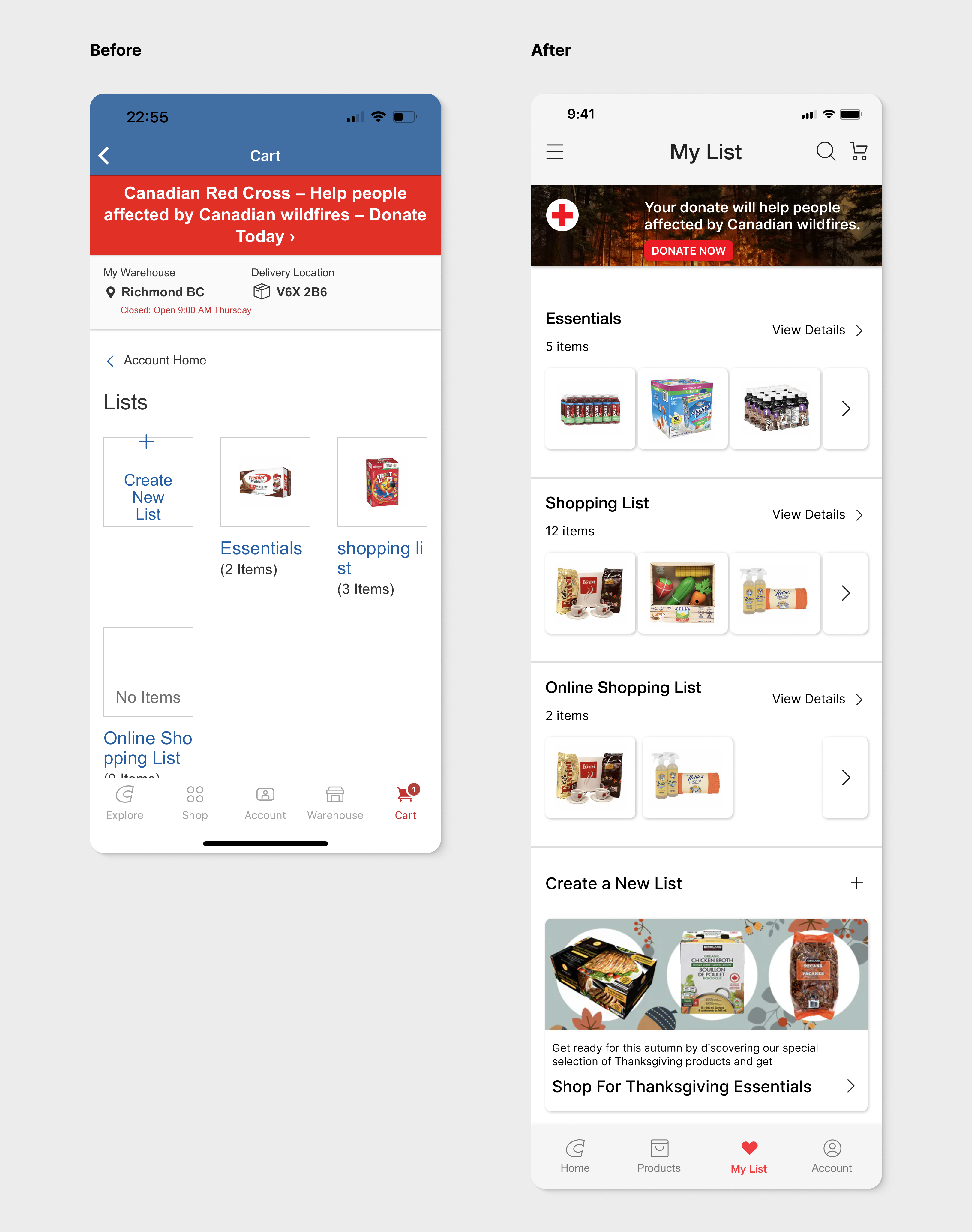
My List
In comparison to the existing layout, the new design situates "My List" within the navigation bar, offering users convenient access to items they intend to purchase. This strategic placement has the potential to elevate the checkout rate. Positioned at the bottom, a dedicated section caters to special promotions and recently viewed items, discreetly positioned beneath the "Create a New List" button.
Prototype
Reflections
Redesigning the Costco app presents a significant challenge, encompassing a multitude of areas that require improvement, ranging from user experience enhancements to refining the user interface. This case study stands as a valuable lesson in prioritizing features effectively. Over the course of two weeks, my attention was directed towards those features poised to yield the most substantial impact on users, from the array of improvements identified.
Another takeaway lies in the realization that what might seem intuitive to one individual might not be so for another. Designers, often unwittingly, tend to imbue their creations with their own design-oriented perspectives. However, conducting thorough research and tests aids in obtaining a genuine understanding of how typical users would interact, a practice far more reliable than mere assumptions.
Conducting interviews and soliciting feedback from others throughout the design process also played a pivotal role in reviewing my design approach. This practice reinforced my belief that app redesigns should encompass more than mere visual optimizations. The central focal point should invariably involve augmenting user experience and conducting comprehensive usability research.