


About
SSENSE, a fashion retailer based in Canada, provides an extensive selection of over 500 luxury and streetwear designers, catering to both emerging and established brands. Furthermore, it also create their own unique editorial content.
The primary focus of SSENSE is eCommerce, specializing in the sale of luxury goods. However, they also prioritize providing customers with up-to-date information on the latest fashion trends through their editorial content.
SSENSE operates a website and provides mobile apps for users. It's worth noting that their existing application is a hybrid app, combining features of both a mobile app and a web app. While the app largely offers a responsive version of their website, it unfortunately inherits some of the website's issues, resulting in a somewhat disorganized home screen.
Design Process
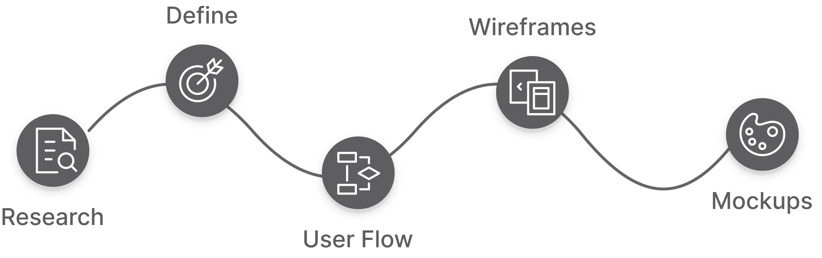
[Need Update] I applied a user-centric design approach through several design thinking iterations to ensure that Splink not only addresses users' problems but also provides a useful, intuitive, accessible, and desirable user experience for the targeted users.
User Research
First, I conducted market research to understand and target SSENSE's users.
Next, I analyzed the apps of their competitors, which aided in identifying SSENSE's unique market segment. Using this information, I created a new user flow and redesigned the shopping process, starting from the categories displayed on the home page and simplifying the checkout process.
Additionally, I incorporated a story section into the app, featuring SSENSE's original editorial content from their website. To enhance user convenience and boost purchase rates, I introduced an independent wish list section accessible through the new navigation bar, allowing users to easily track and save products they are interested in.
Market Research
Target Young Adults
According to a figure from Elle Canada published in early 2017, 80% of all SSENSE sales were to people aged 18-34 which is exactly the market the Atallah brothers are intending to penetrate.
Found by 25 Years Old
Founded in 2003 by three brothers: Bassel, Rami, and Firas Atallah, SSENSE was destined to be an eCommerce retailer. The three brothers started the company when the oldest of them was just 25 years old.
Average Clothing Price
SSENSE is somewhere in the range of 400-500 dollars but somehow they still manage to attract an remarkably young audience.
Highest Discount Range
There are two sales each year with markdowns of up to 70% but there are no discounted prices in any other capacity on the site and the application.
Competitors Analysis
LYST
Luisaviaroma
Matchesfashion

Lyst
Pros:
- Filter includes discount ranges.
- Many filters and sorts to choose from to facilitate user browsing behavior.
- Recommendations.
Cons:
- Assembly of the buyer's shop, not well organized. Duplicate products often appear.
- No section for editorials.

Luisaviaroma
Pros:
- Luxury pop-up stores.
- Separate section for editorials.
- Recommend the top 10 ranking brands for customers.
Cons:
- They have women, men, kids and home, but emphasis on women’s brands only.
- Customer care is weak.

Matchesfashion
Pros:
- Shop the look. Users can easily get the full collection.
- Super clear categories and navigation.
- Design is organized.
Cons:
- Not so many filters to choose from.
- Lack of customer service, they only have phone service, which is inconvenient for foreigners.
The Problem
No Focus
If new users open the app in first time, they may feel don’t know where to go, as the app has a lot offers on the home screen, but without orders. And so many disordered choice can be overwhelming for users.
Lost Its Trait
What sets SSENSE apart from its competitors is its providing users with editorial content about fashion, markets, art, etc. Its homepage(website) is more like a fashion magazine than an e-commerce site, while its app has completely removed the editorial content section which makes it lose the trait.Search bar, filter and sort
The search feature only shows in text, no icon nor frame. In addition, the filters and sort buttons violet the content. And because it is a hybrid app, the font size is extremely small, which also leads to accessibility problems.
Goal
The goal centered on elevating the shopping experience within the SSENSE app, tailored to a distinct audience: devotees of luxury fashion and design aficionados. My objective was to simplify the processes of viewing, searching, and purchasing items on the SSENSE platform. This goal was accomplished by rearranging the home screen to establish a coherent layout and integrating a more user-friendly navigation and filtering system. Furthermore, I placed a strong emphasis on enhancing user accessibility through the enlargement of font sizes, ensuring a smoother reading experience. In order to infuse the app with the essence of the renowned editorial content, I seamlessly incorporated it into the user journey.
The Solution
eCommerce Priority
As a redesign project, I plan to bring new innovative ideas to the homepage site, make it focus on the purchase behavior more, as well as keep the idea of the fashion editorial content.
Improve Navigation And Search
Bring the third level navigation for customers, easy to navigate. Users can easily find what they want, and have better understanding of what brands and merchandises the website has.Industry Standard
Change the search feature location from left side to right side, also add the bar and the icon. And add Filters to the product list page to make it easier for users to find the products they need.
New User Flow
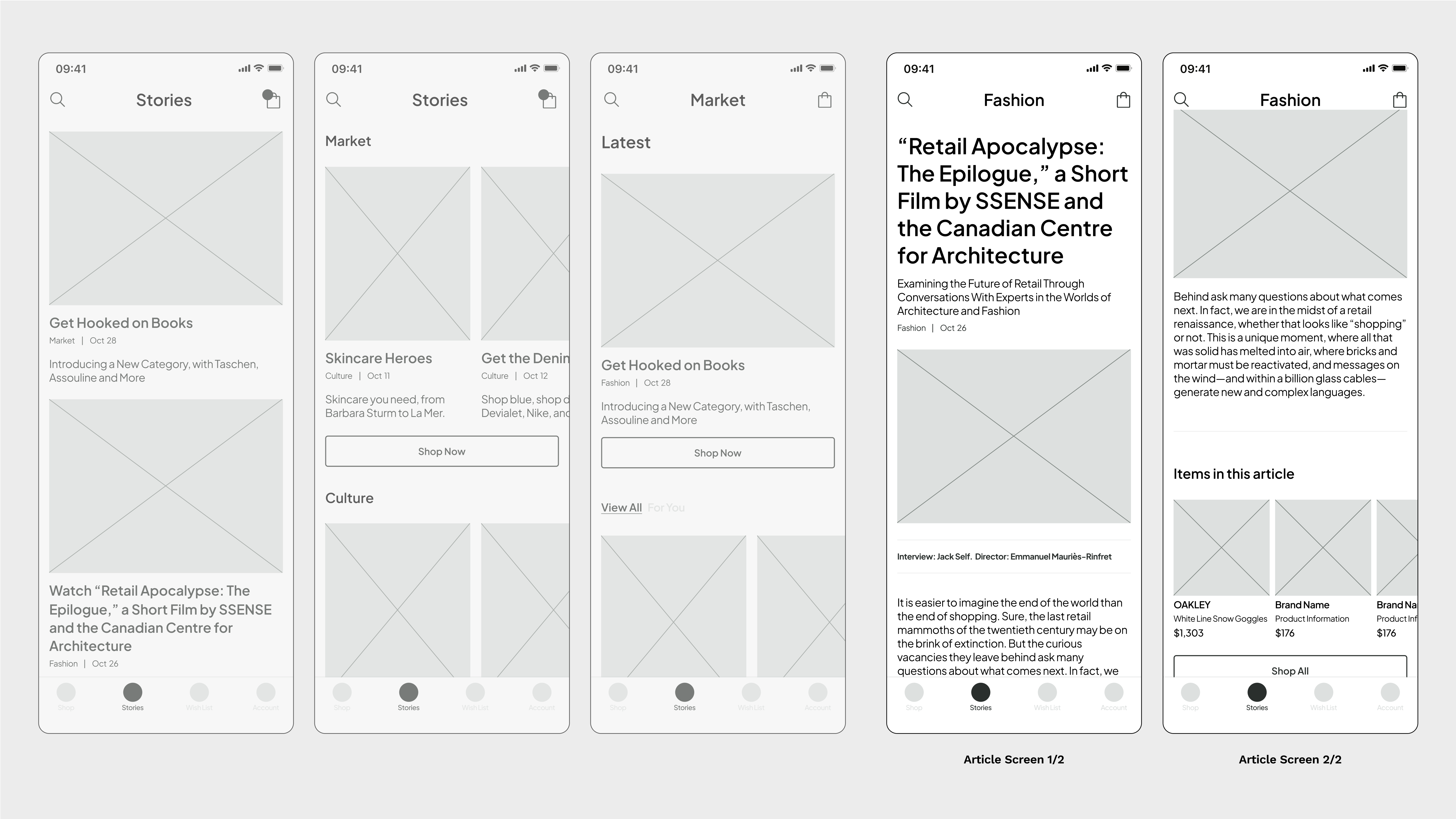
In this revamped user flow, I initiated an onboarding process as the first step, aiding users in configuring their shopping preferences. To ensure an instinctive shopping experience, I proceeded to rearrange the product displays, segregating clothing items from other products. Additionally, I streamlined the checkout procedure for simplicity. Meanwhile, the wishlist has been elevated to a prominent position within the navigation menu. This strategic move is aimed at highlighting items that hold the utmost appeal for users, thus enhancing the likelihood of successful checkouts. Lastly, the cherished "stories" section of SSENSE makes its triumphant return to the app. Not only does it offer users insights into the latest trends in fashion, art, music, and more, but each article is also equipped with an "ACT" button that enables swift access to products featured in the article, consequently bolstering sales opportunities.

Wireframes
SSSENSE operates as an e-commerce website without a physical store. Consequently, users can solely access product information through the app. As I embarked on the task of redesigning the wireframes, my foremost priority lay in reintegrating users' familiar behaviors while ensuring the delivery of comprehensive and lucid product details.
The strategic implementation of large-sized photos, coupled with essential information, serves as a potent tool to effortlessly capture users' attention. Augmented by an intuitively structured and meticulously organized system of filters and sorting mechanisms, users are empowered to swiftly pinpoint their ideal products.
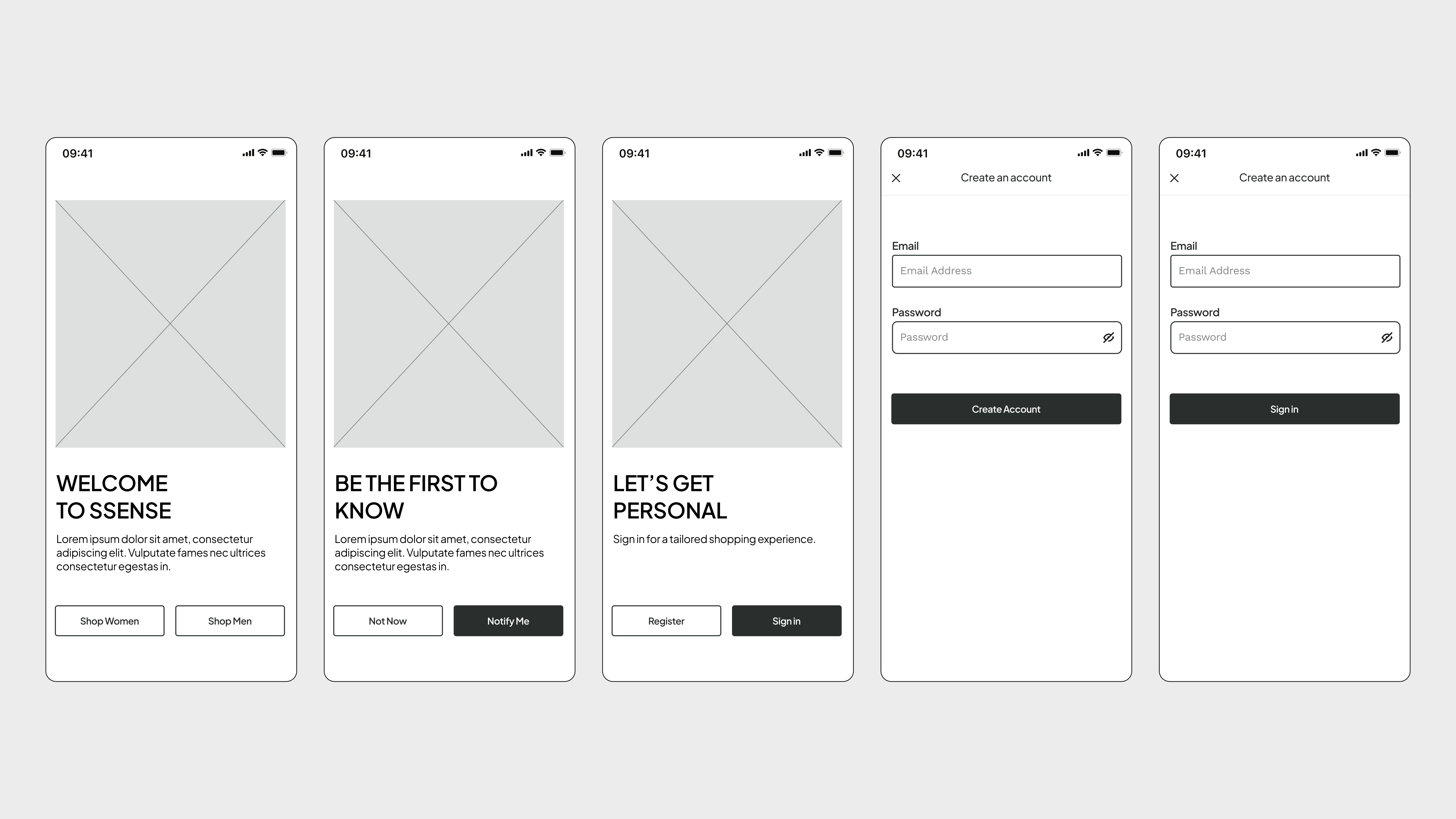
Onboarding and signin/signup
Shop(Home)
Filters and sort
Item, My Bag and Checkout
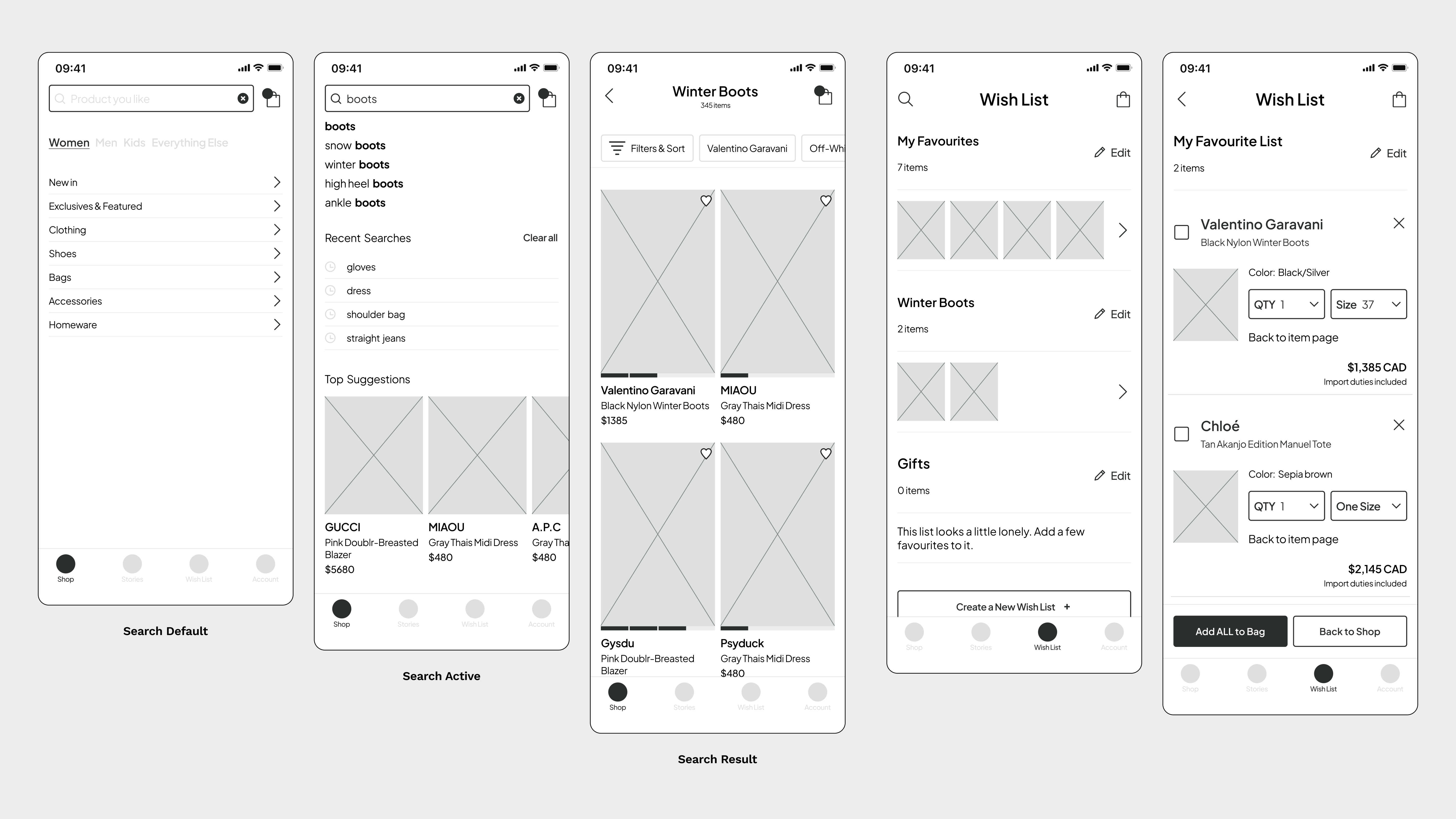
Search and Wish List
Story and Article
UI Kit
The design of the SSENSE website and app introduces a layout that challenges users' familiar patterns through the use of small fonts, densely packed content, and a plethora of actions that diverge from established user habits. While some might label this approach as daring, edgy, and thought-provoking, it regrettably falls short in terms of user-friendliness. Notwithstanding this, the central objective remains unwavering – facilitating e-commerce transactions and product sales.
During the process of UI redesign, I consciously chose to preserve the existing color palette, thereby upholding the vibrancy of the products. My focus, instead, centered on elevating the manner in which products are showcased, ensuring a bold, prominent, and attention-commanding presence for users. This strategy harmonizes with the brand's distinctive market positioning, all the while delivering a more instinctive and gratifying user experience.
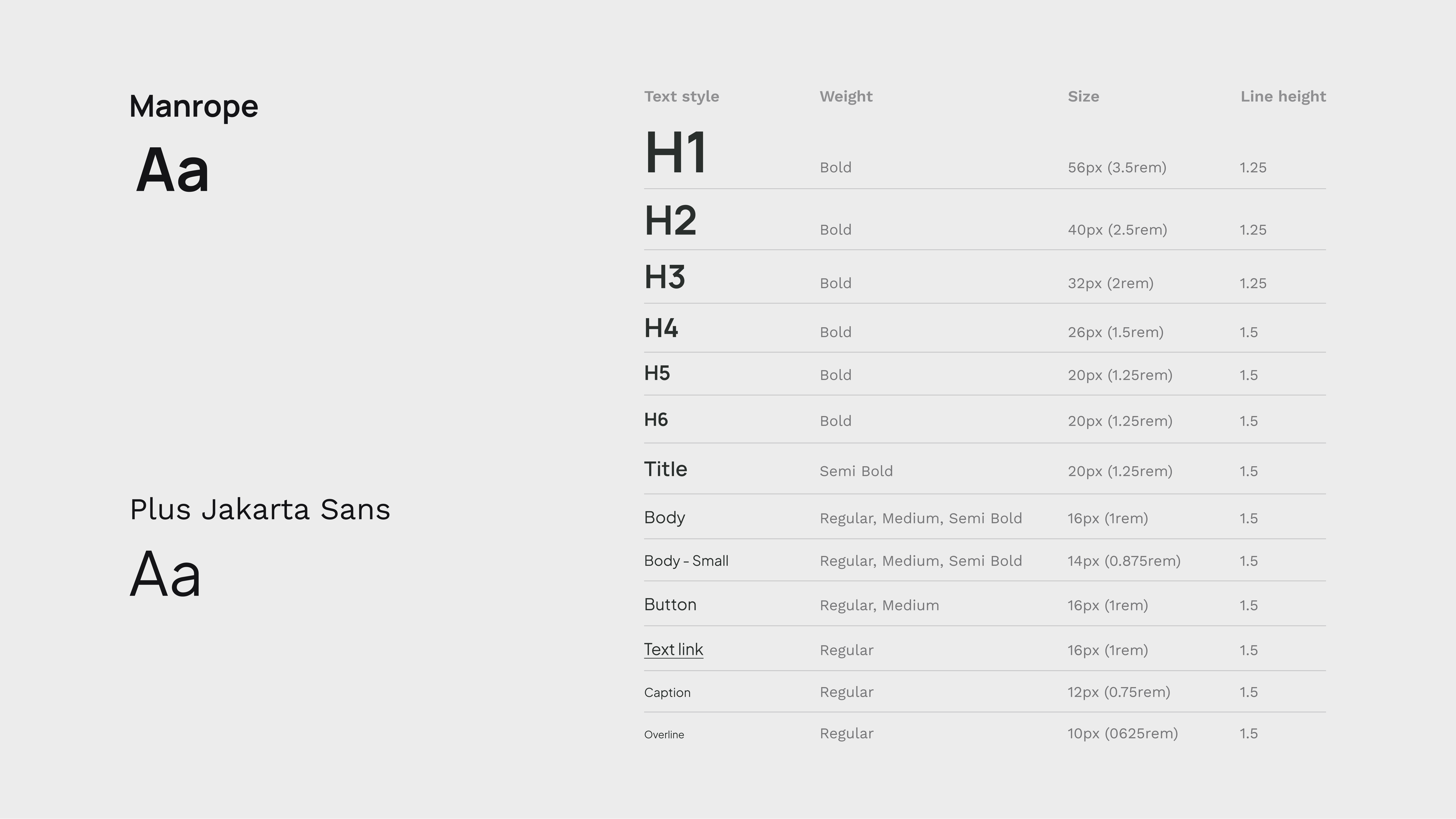
Typography
I choose "Marope" as the heading and title to enhance the app's contemporary, minimalist, and chic aesthetic. For the body text, I opted for "Jakarta Sans" due to its outstanding readability. While unobtrusive, its tone has the potential to imbue other elements and the overall composition with expressive qualities.
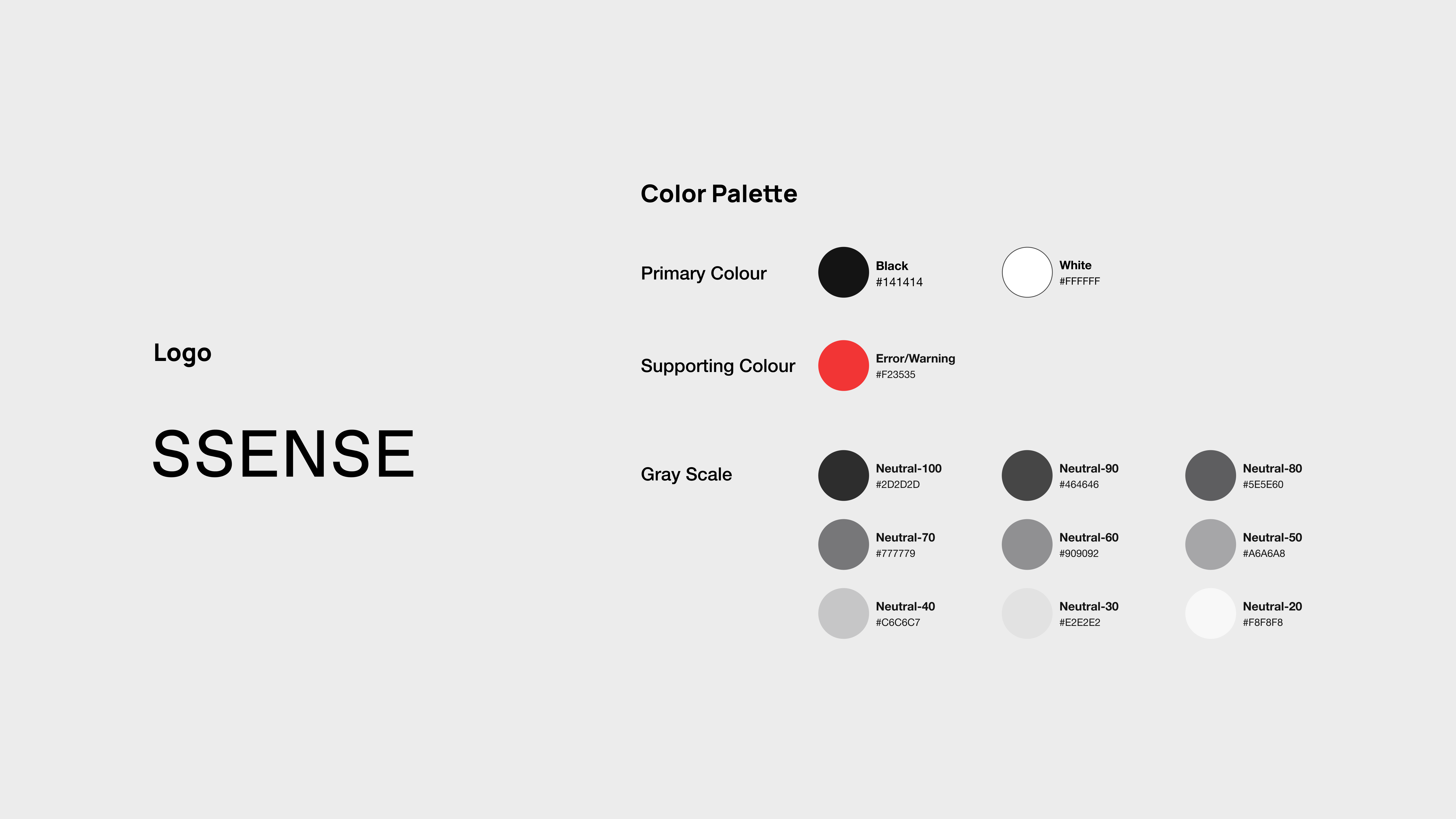
Branding
Since this redesign isn't directly linked to branding, I have preserved the brand logo and theme color palette in their original state. However, I've incorporated a range of subtle grey shades that contribute depth and sophistication to the overall design.
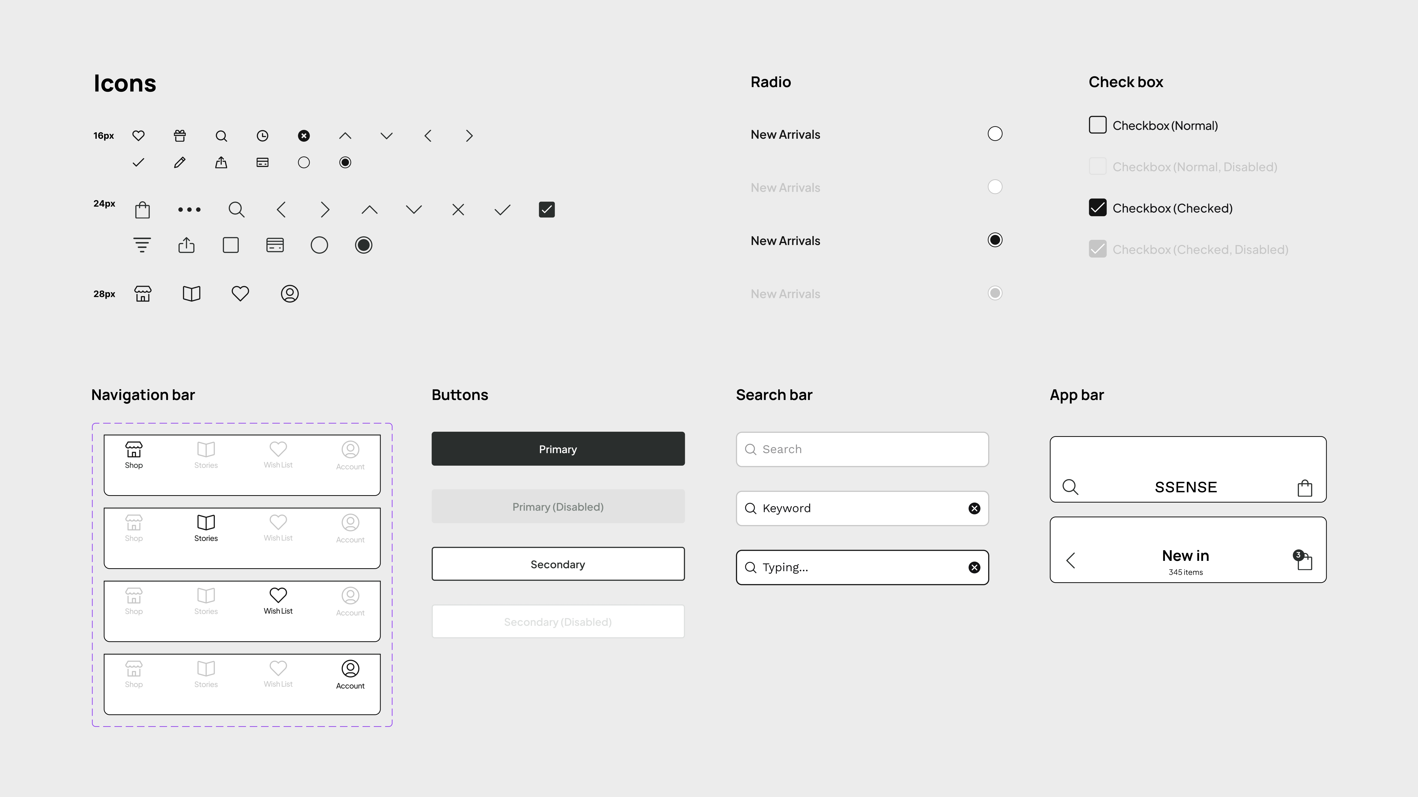
Iconography and UI Components
The selection of icons centers around creating a design that is uncomplicated and direct, which in turn enhances the balance of content. The use of outlined icons complements the typography, resulting in a design that is both lucid and invigorating for the app's visuals. Alongside these elements, the UI components contribute to a user experience that is welcoming and user-friendly.
UI Components-Cards
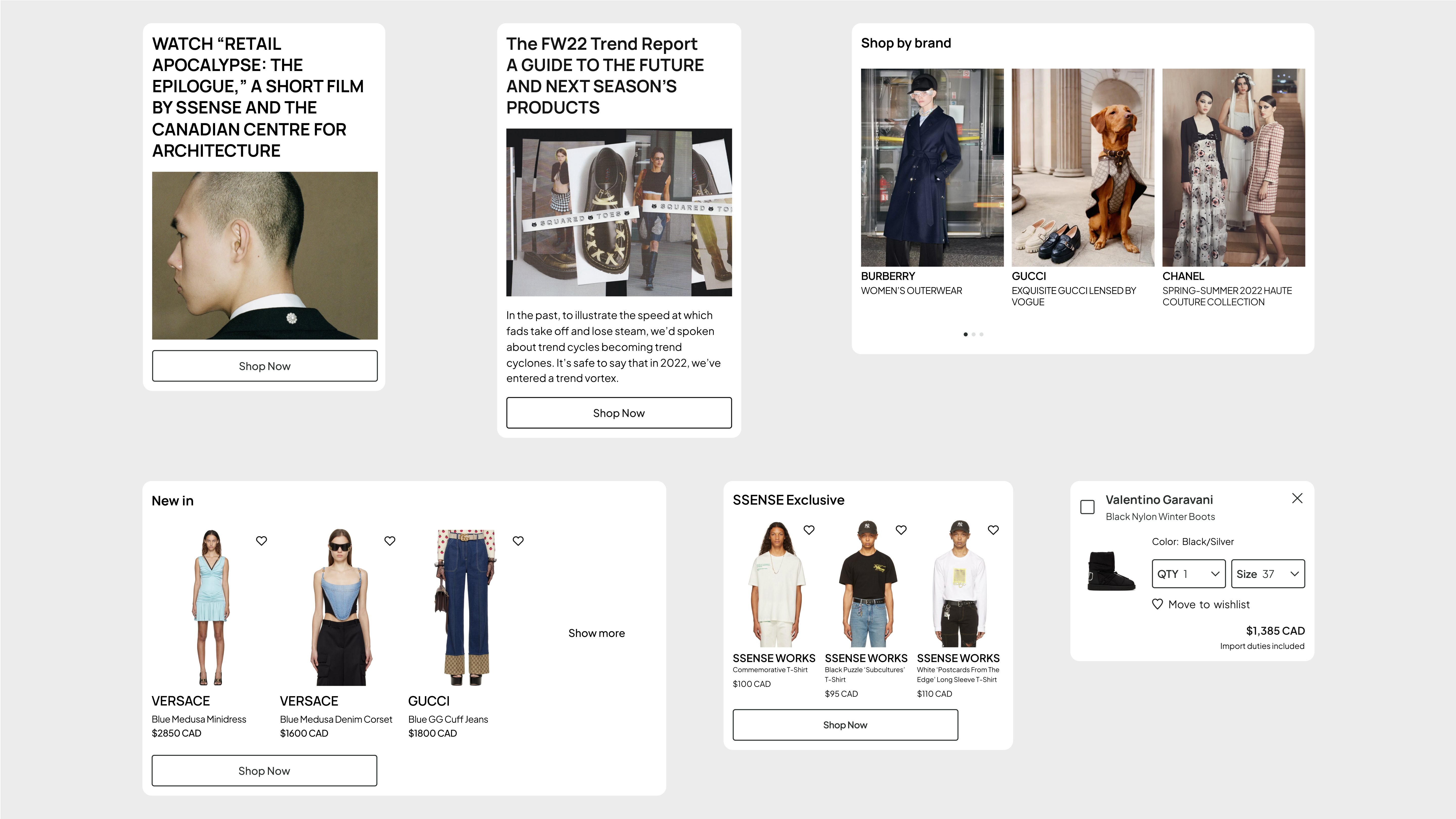
Key Screen Comparison
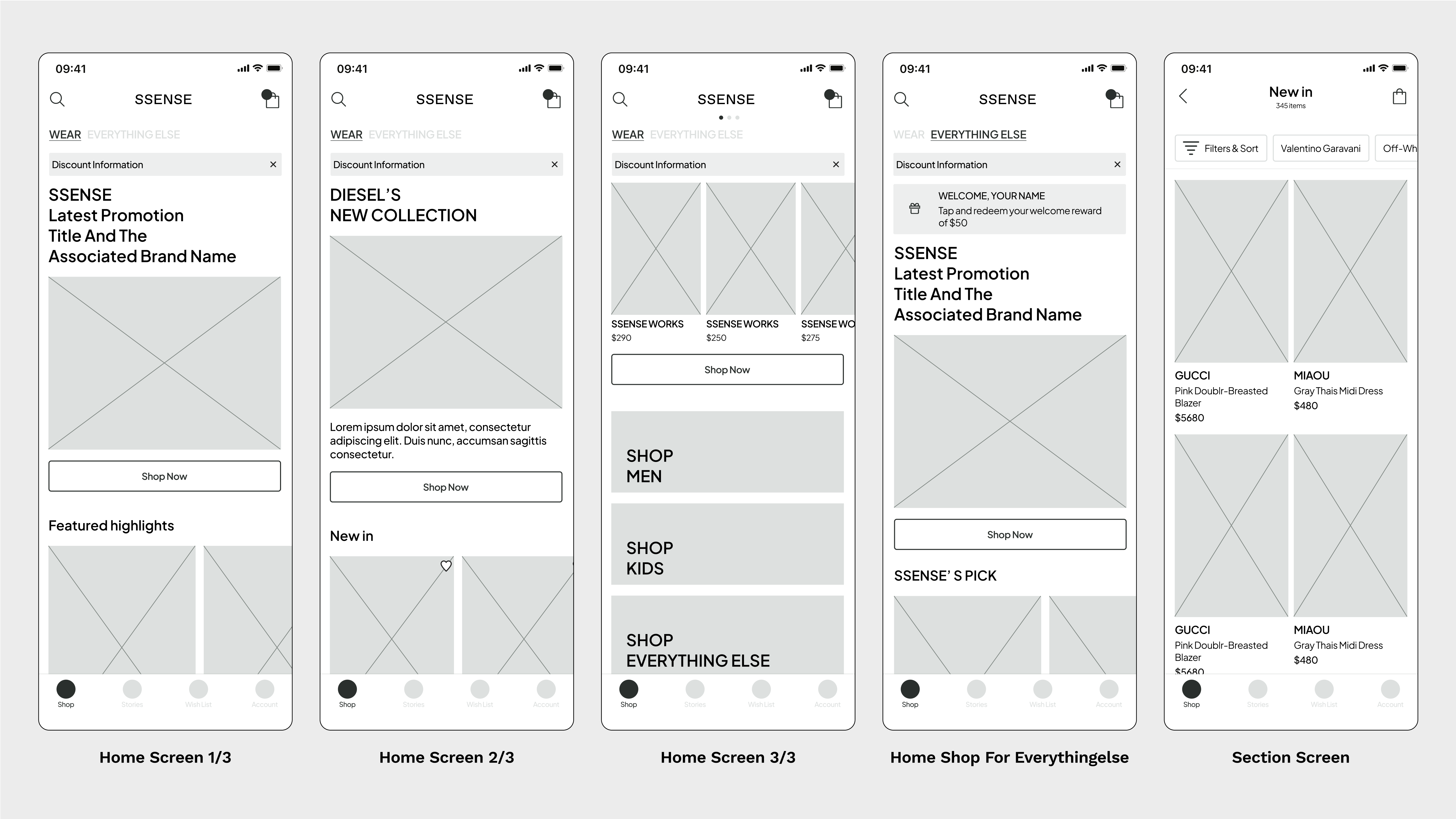
Shop(Home)
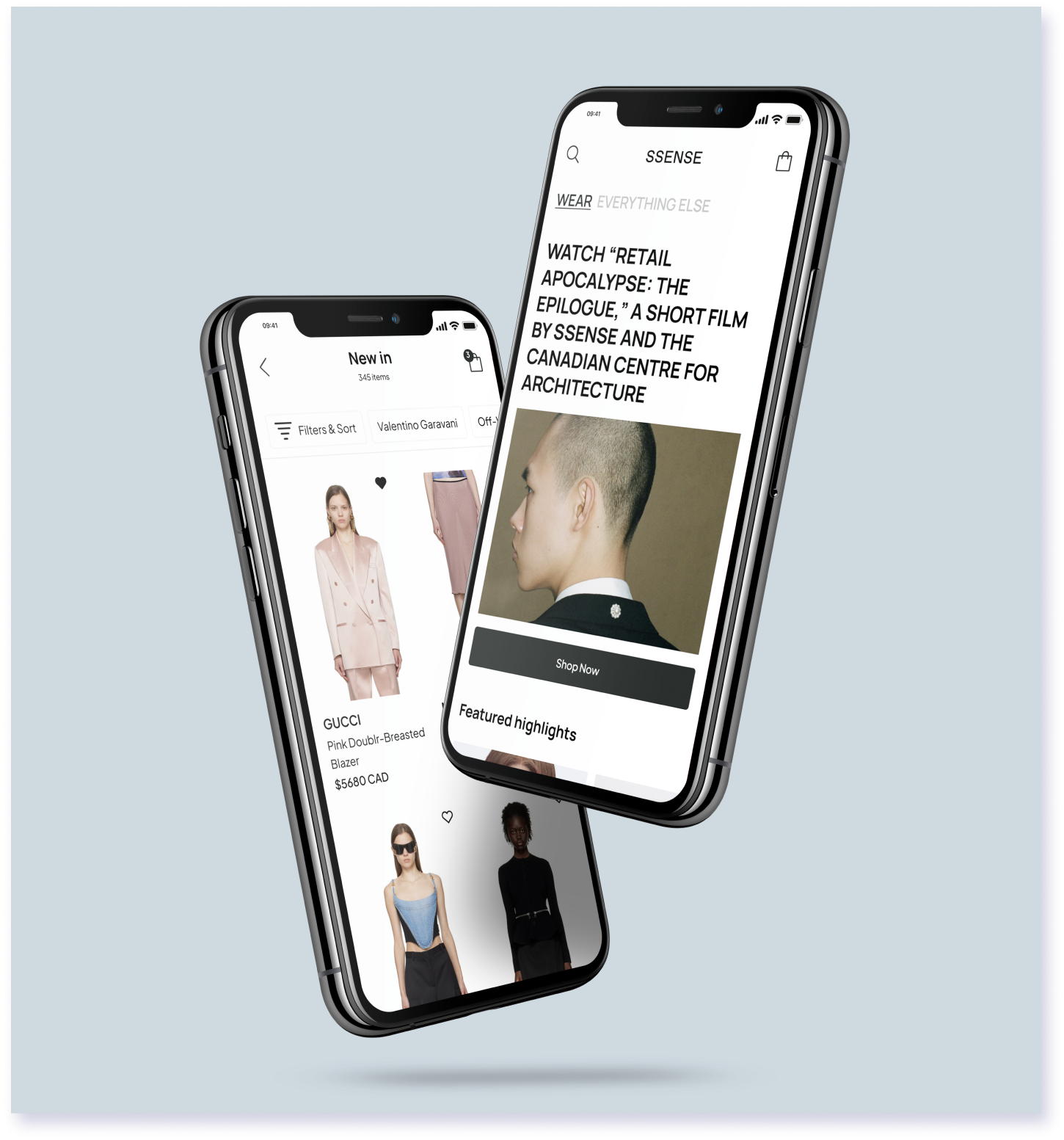
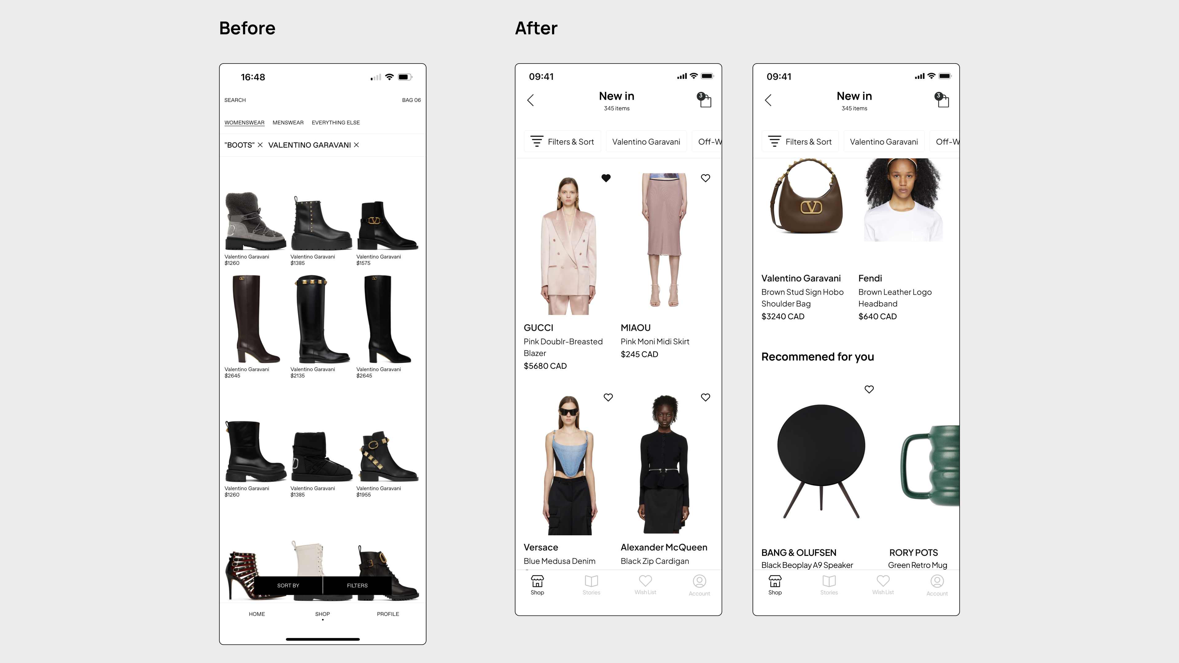
Rather than relying solely on text to introduce new arrivals from various brands, I've employed photos and prominent titles to captivate users' interest. I've transformed individual brand recommendations into exclusive highlights, showcasing multiple brands simultaneously, and these featured items are exclusively available on SSENSE. The "New Trends" section replaces both "Recommended Styles" and "New Skirts," offering users a straightforward avenue to discover the latest trends. To streamline and organize the experience, I've amalgamated the bustling and disorderly elements into a unified "New In" section, dedicated to showcasing fresh items across diverse categories.
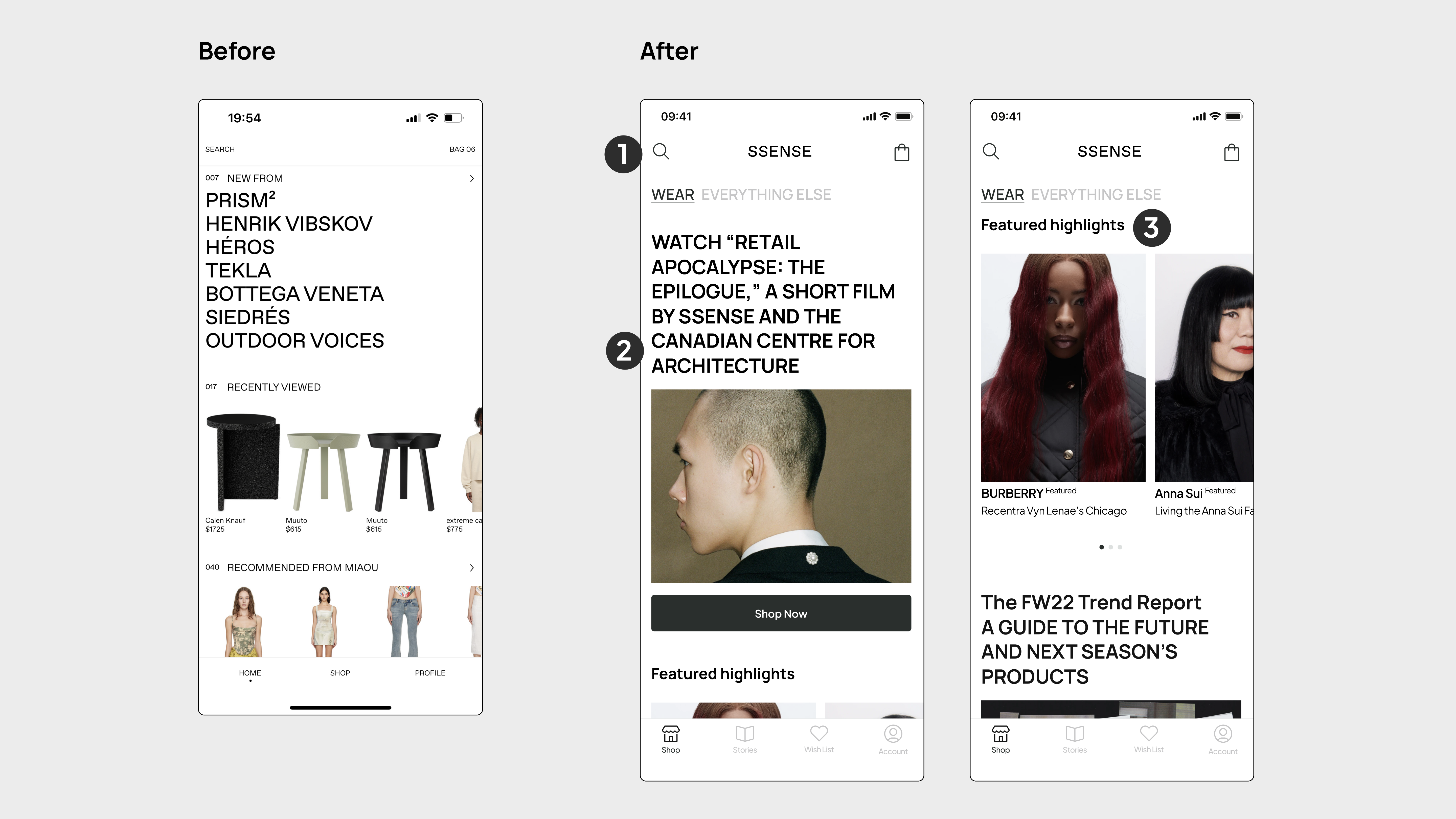
Shop(home)-1
An intuitive, user-friendly top bar replaced the older one, providing users with a seamless search experience. Two tabs have been added to assist users in effortlessly switching between wearables and other products. Eye-catching photos and bold titles have been incorporated to enhance the attractiveness of the top story section for users. Furthermore, I've transitioned from single-brand recommendations to exclusive highlights, showcasing multiple brands exclusively available on SSENSE. "Recommended styles" and "New skirts" replaced by "New trends", offering users a simple way to explore the latest fashion trends.
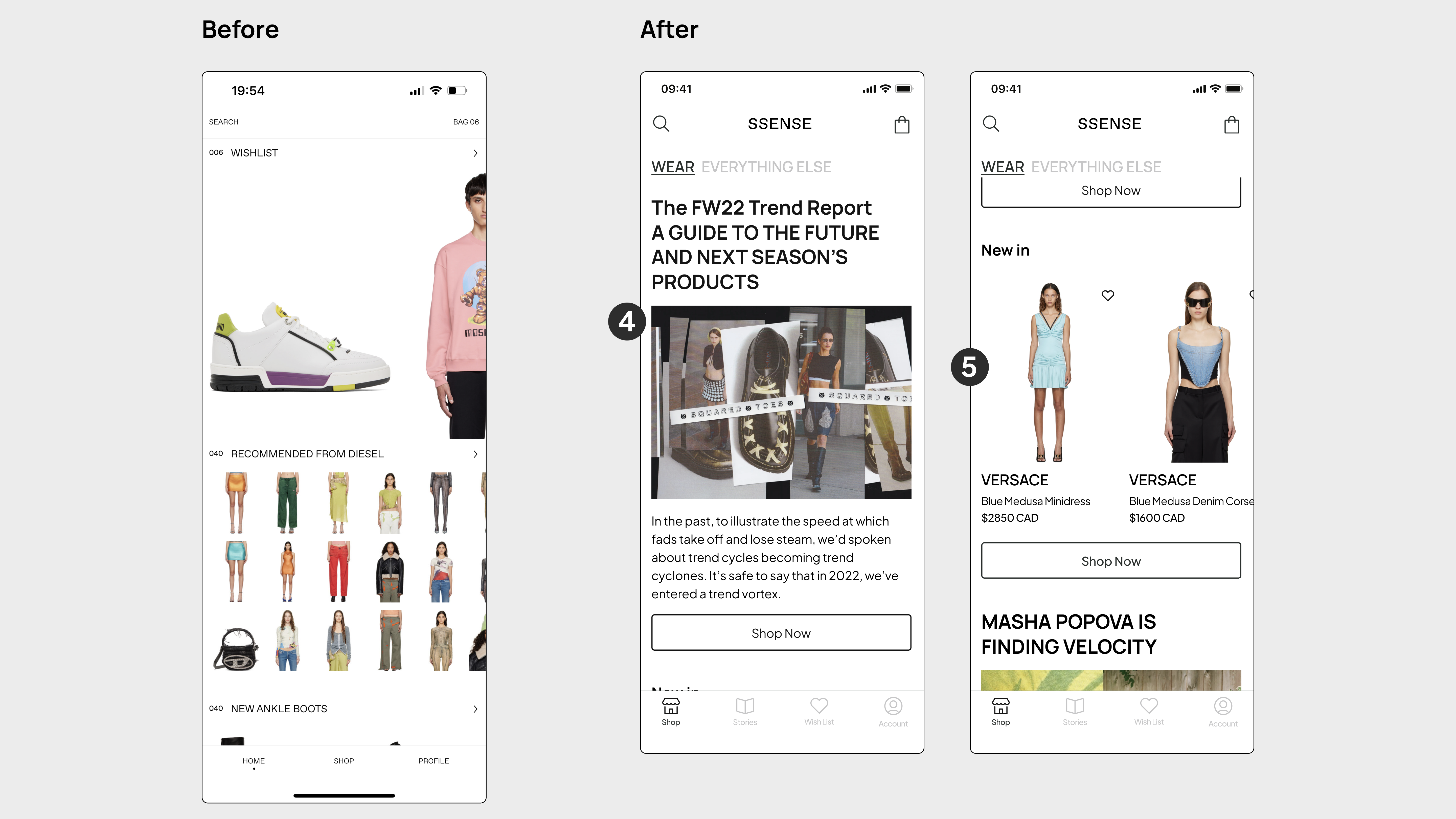
Shop(home)-2
Simplified the busy and chaotic content by merging it into a "New in" section, which is focused on showcasing new items across various categories. In the product cards, larger photos and the heart icon have increased the likelihood that users will add items directly to their wish list.
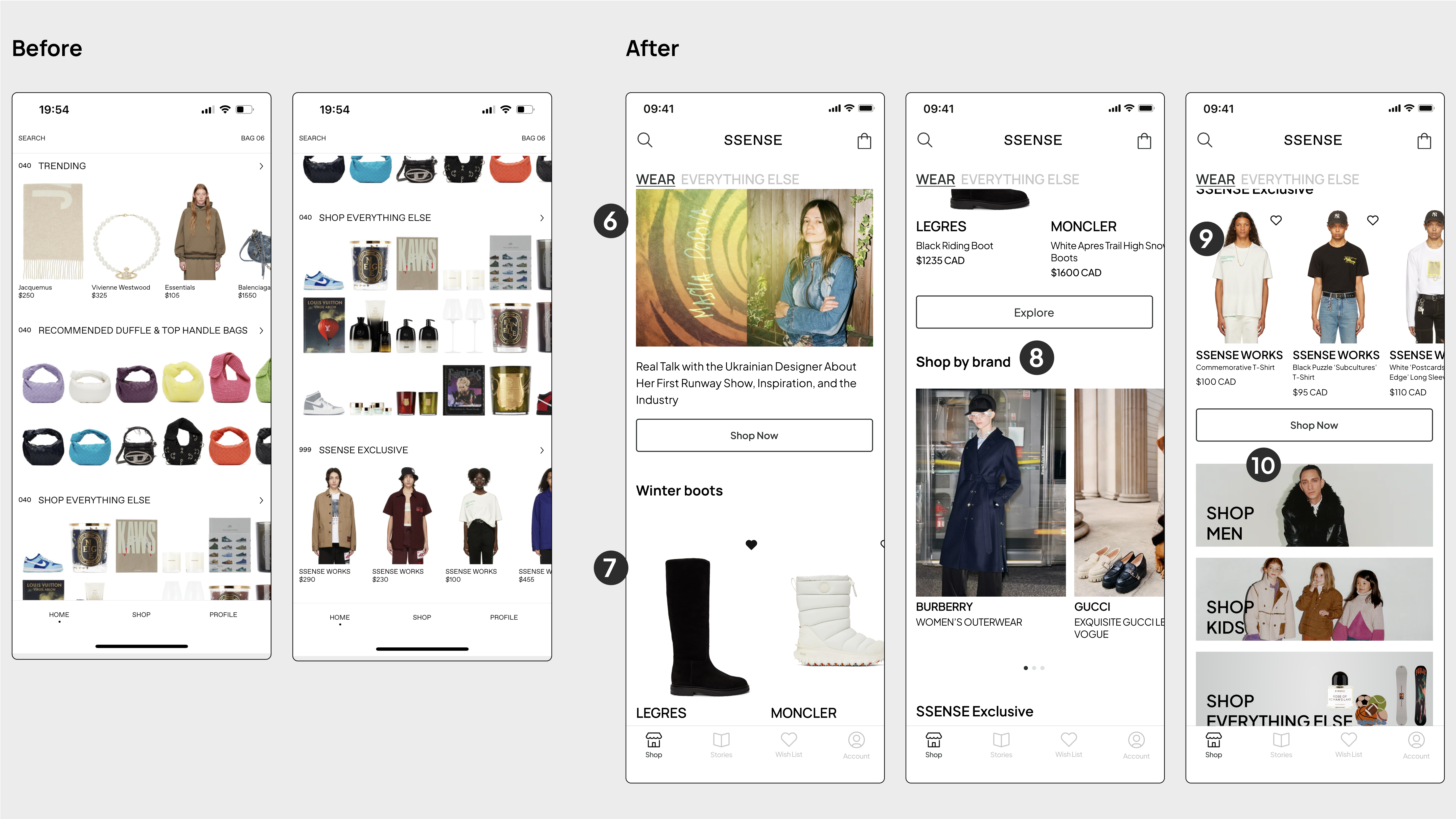
Shop(home)-3
A seasonal section has been added on the home screen for users seeking seasonal items, offering greater shopping convenience. SSENCE's exclusive products are organized with in a clearer layout and a button for users to explore more. To streamline the experience, image buttons have been added at the bottom, enabling users to easily transition between different shopping sections.
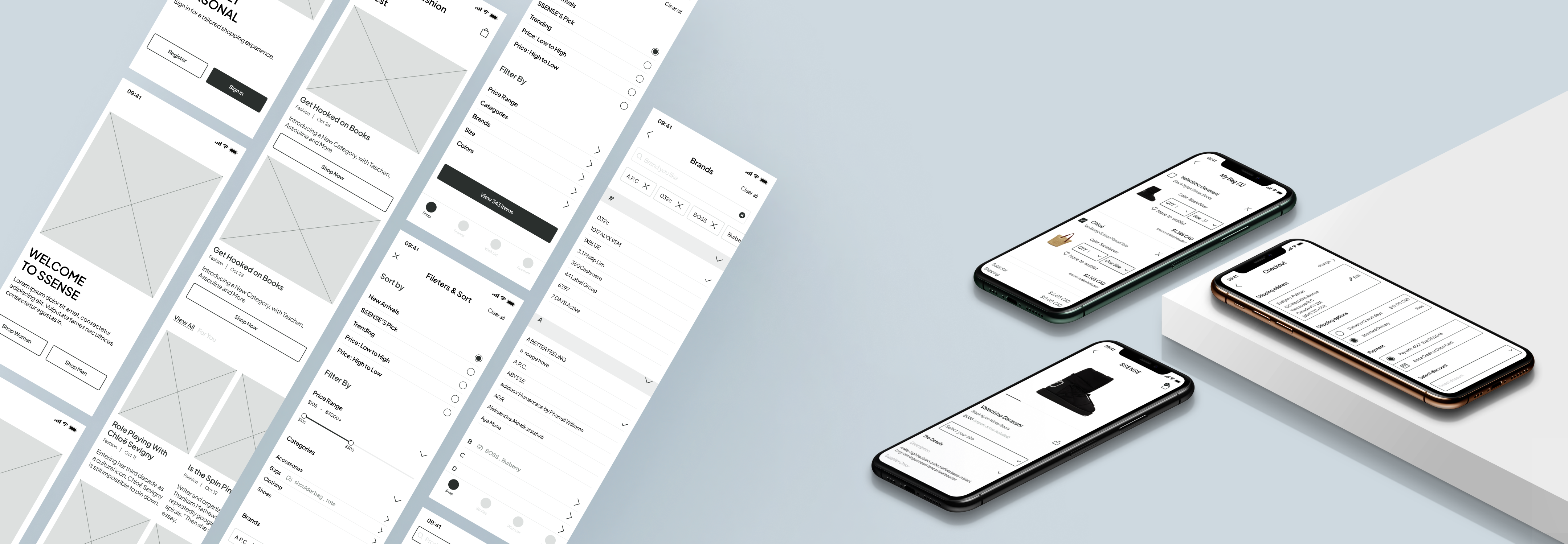
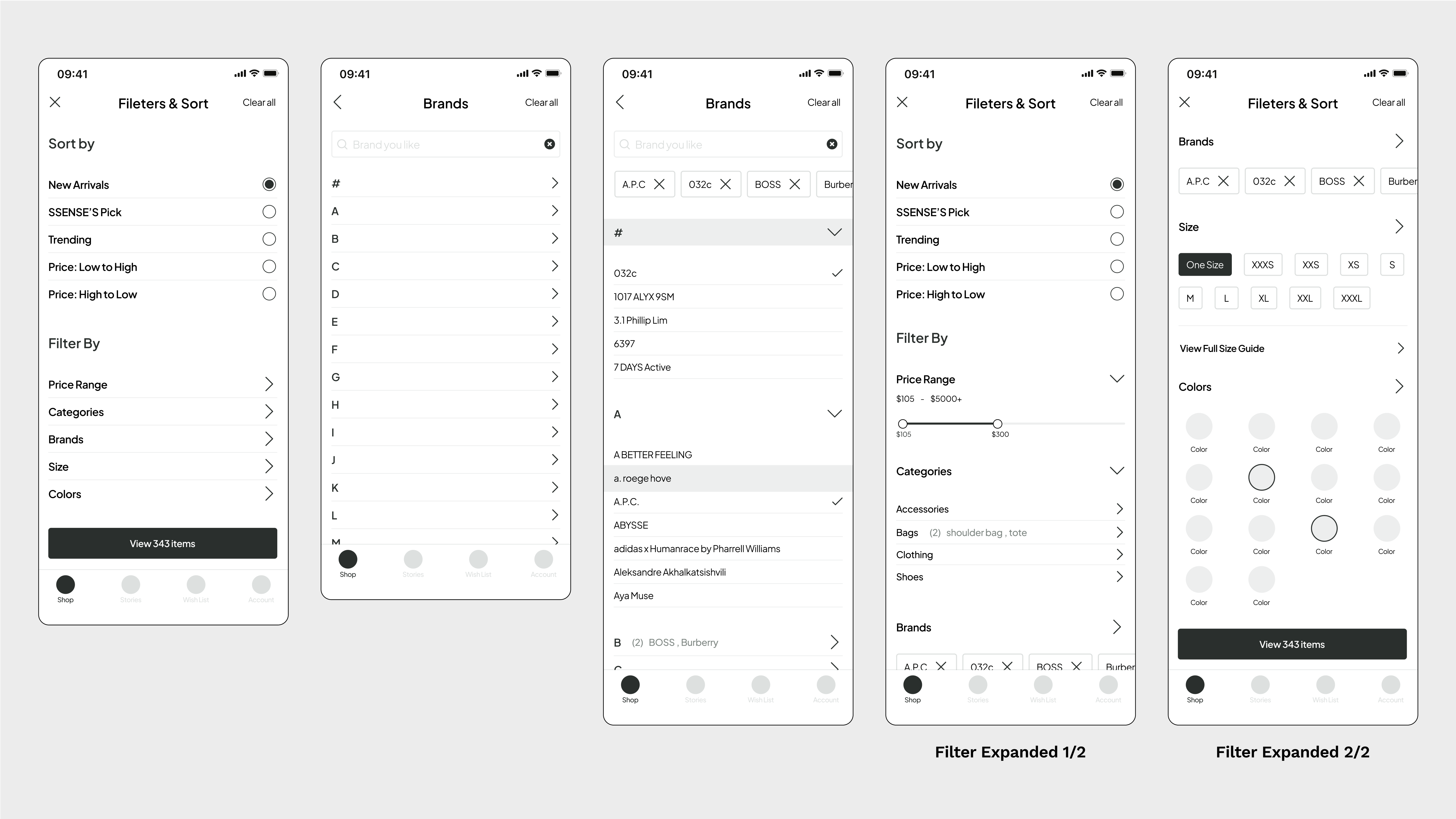
Search Results with Filter
I improved Filters and Sort more obvious for users and easy to access. Instead of showing more but small item photos, display large and less photos. The blank space corresponds to SSENSE’s position, which is selling luxury products. Also, I introduced an exclusive personalized recommendation section for registered users.
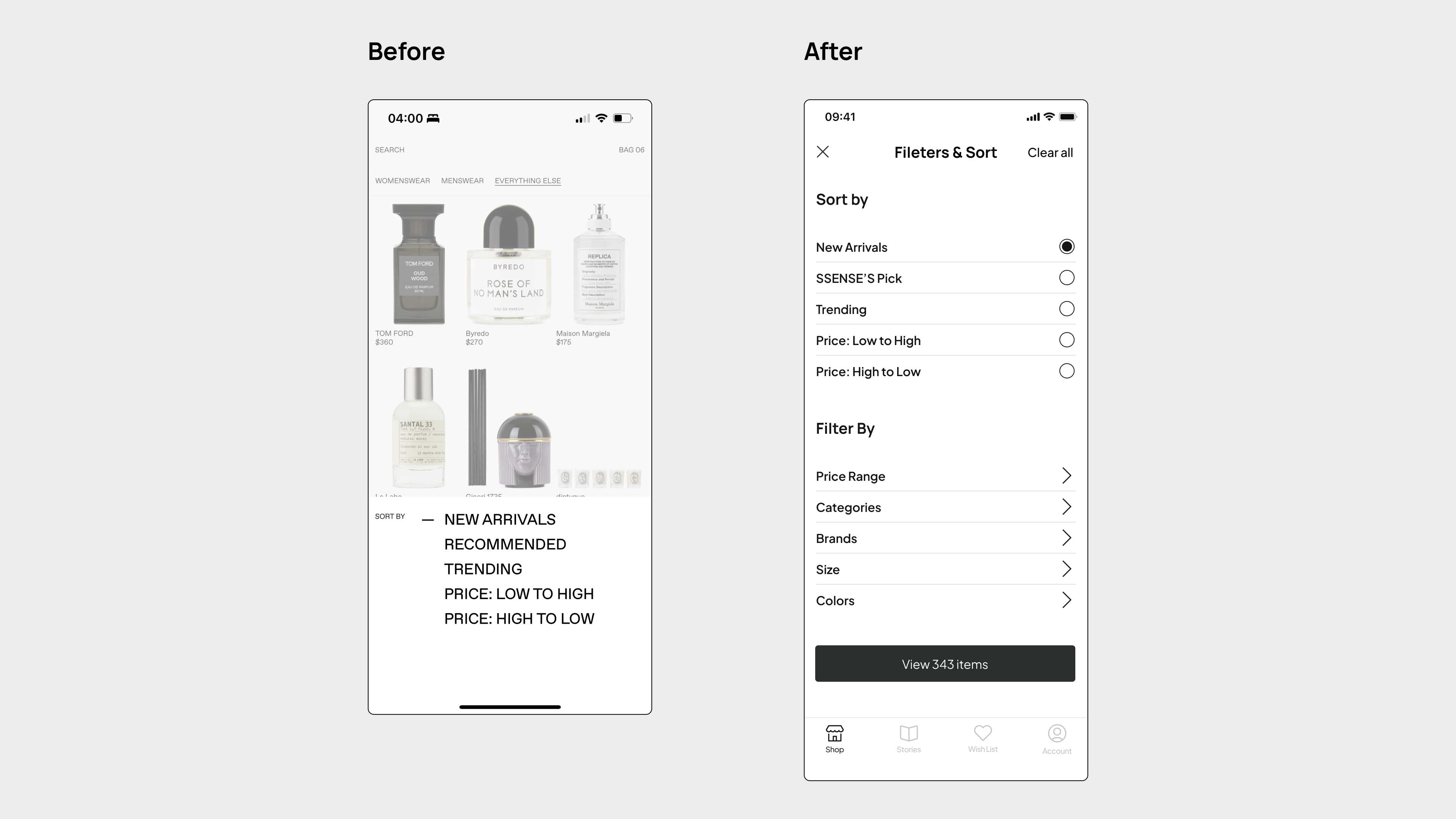
Filter and Sort
I've made several enhancements to the app's user interface. First, combined the sorting and filtering options for a more streamlined experience. Additionally, inspired by the SSENSE website, I've addressed the lack of a secondary menu and hierarchy in the app to reduce information overload. Specifically, refined the secondary menu within the filter section. Also introduced a price range filter to aid users in finding products within their budget. Furthermore, added color samples alongside text options, improving efficiency for color selection while still maintaining accessibility.
Filters and sort
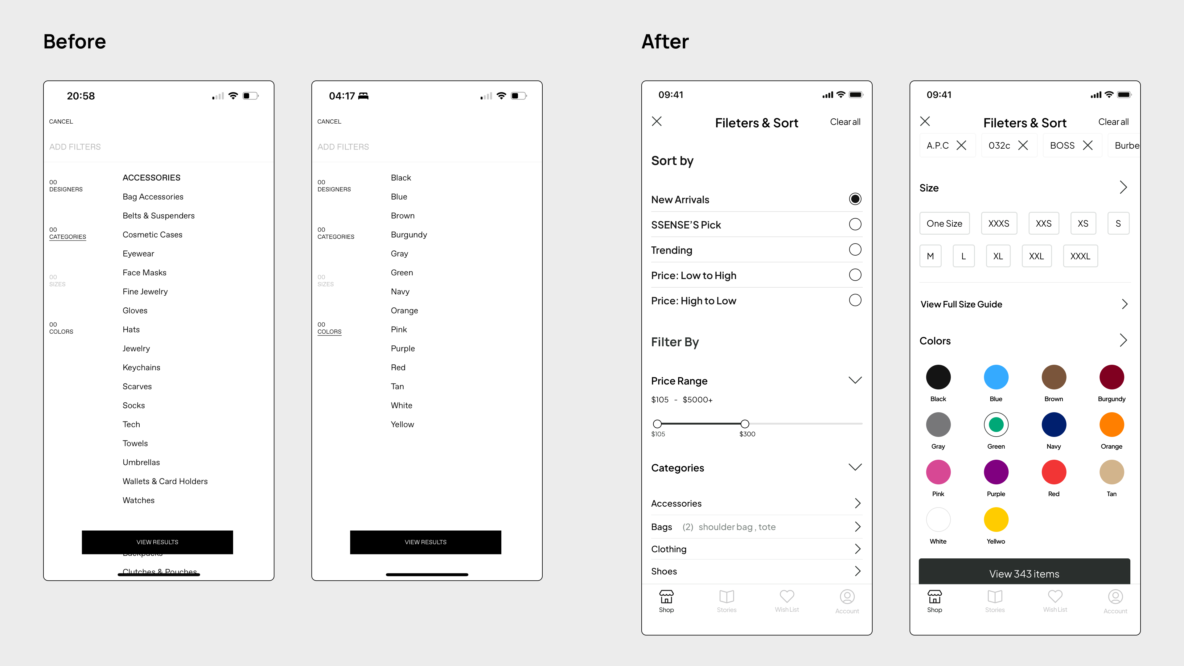
Filters expanded
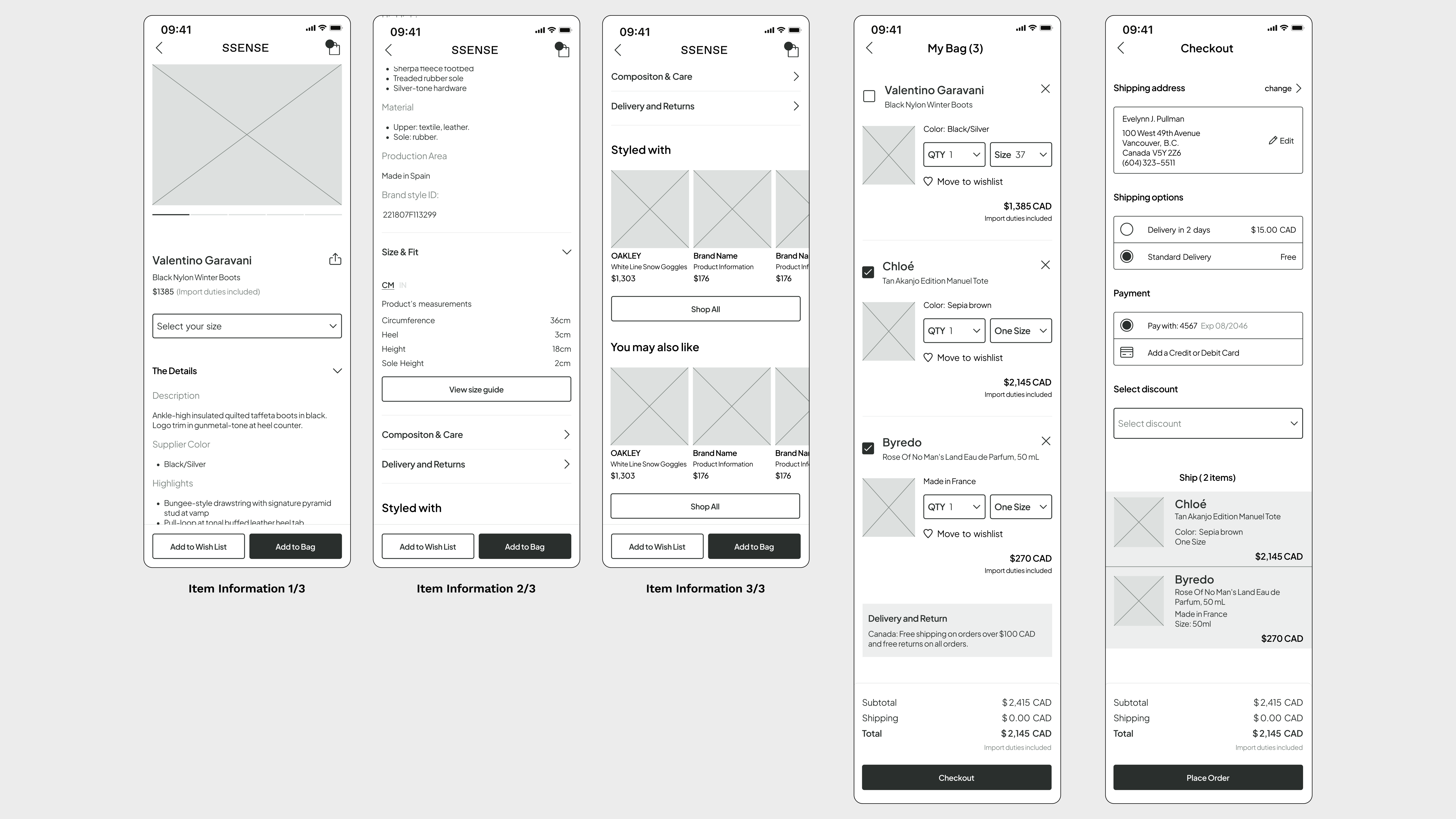
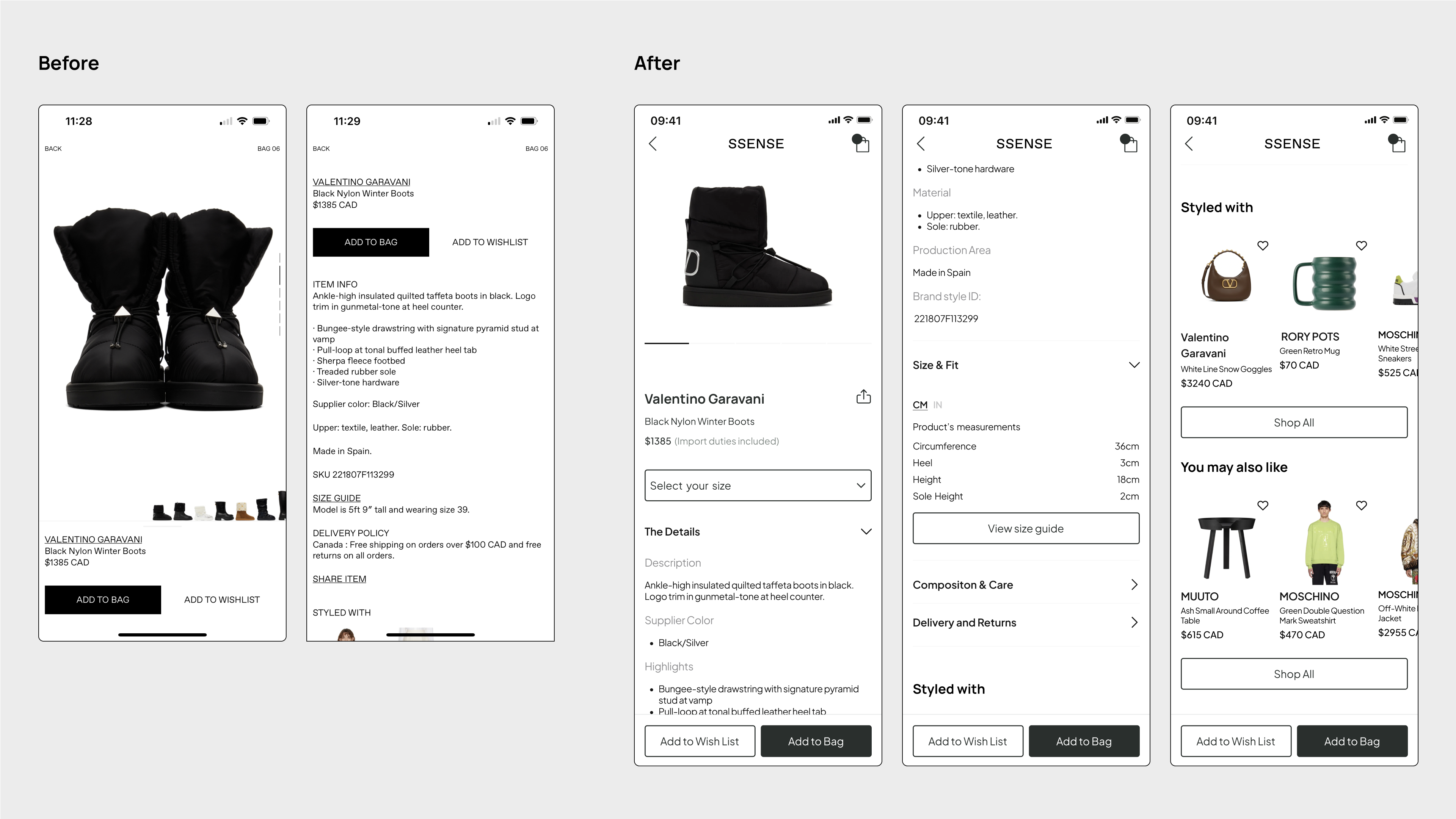
Product Detail
I've reverted to the industry standard by implementing horizontal swiping, which is a more familiar user behavior, as opposed to the less commonly adopted vertical photo-swiping approach used for viewing additional products. Furthermore, I've removed the inconspicuous brand boost at the bottom, as its small size makes effective interaction challenging. The original method of accessing detailed information required swiping the bottom sheet, where the 'Add to Bag' button is located—this approach proved to be cumbersome. To tackle this inconvenience, I've anchored the sheet at the bottom and consolidated all information onto a single page. This provides users with the convenience of vertically scrolling for seamless access.
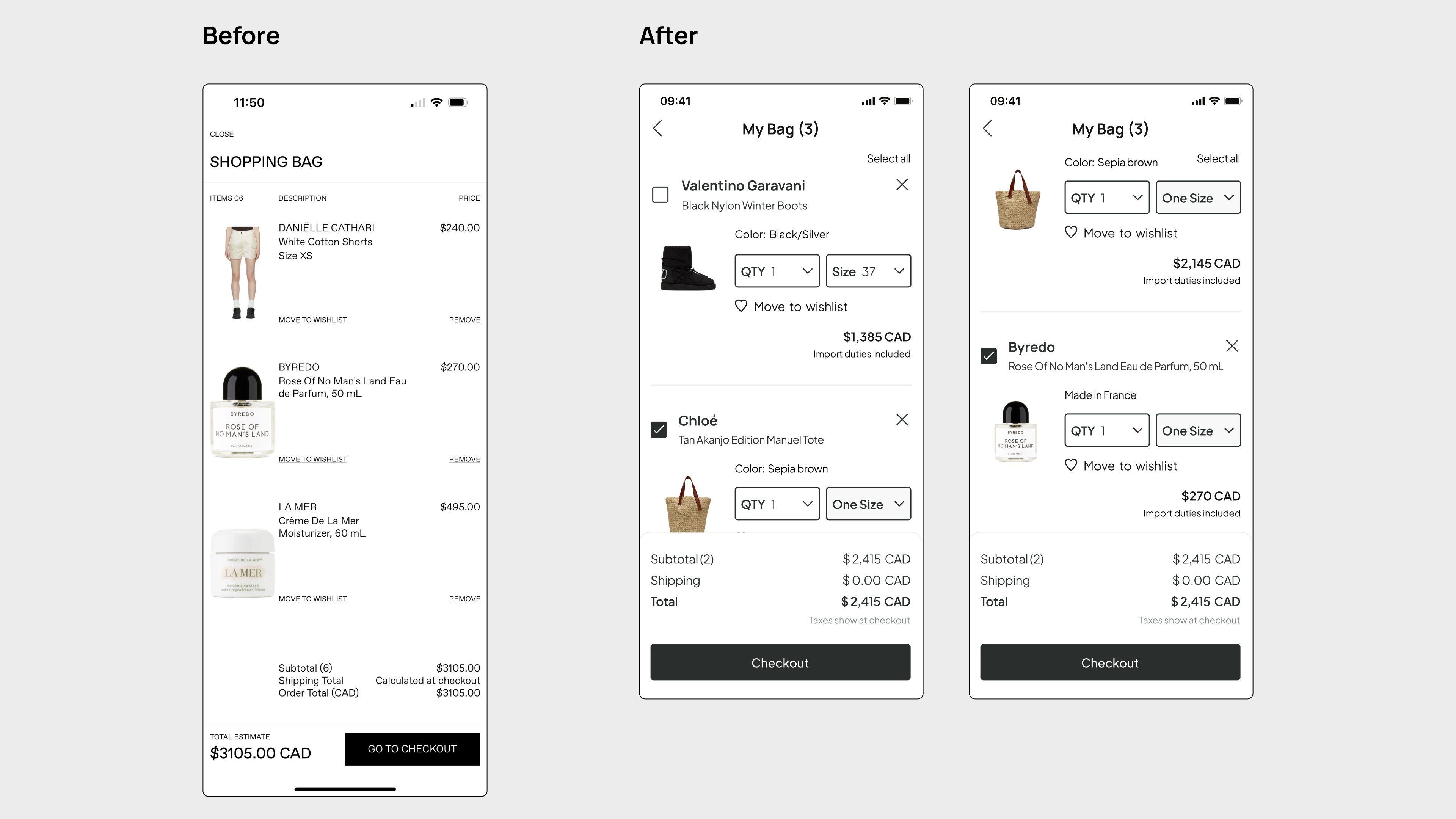
My Bag
The existing design of the "My Bag" section presets all products for checkout by default, utilizing minimal text for delete and wishlist-saving options. While I acknowledge the intention behind this approach, it inadvertently detracts from the user experience. In response, I've introduced checkboxes in proximity to each product and a prominent delete icon located in the upper right corner of each item card. Additionally, a "select all" text button grants users greater flexibility for checkout decisions. The inclusion of quantity and size options within the item card simplifies the process for users who wish to make changes.
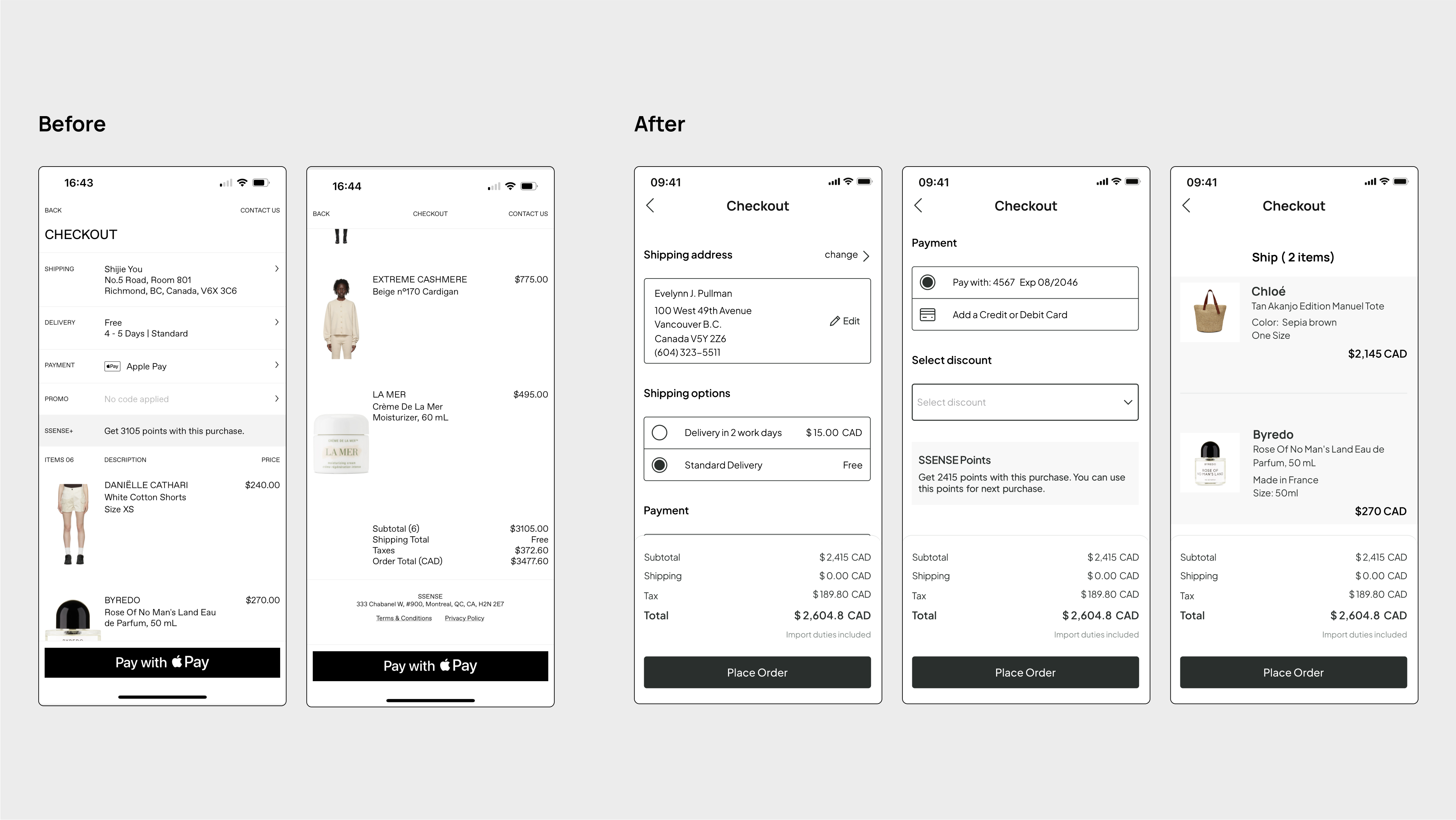
Checkout
In the checkout section, I have enhanced the design to empower users in configuring and altering their shipping address. Rather than employing vague and nearly imperceptible headings, I've utilized large, bold fonts to deliver explicit guidance to users. The combination of icons and accompanying text minimizes the likelihood of misinterpretation. Rather than imposing predetermined shipping options and payment methods, I've established an intuitive and user-friendly mechanism for users to seamlessly switch or modify their choices. Moreover, I've employed distinct background colors for items, which serves as an indicator for users to readily verify the correctness of their selected products during the checkout process.
Reflections
This case study has prompted me to realize the crucial balance required between brand identity, app functionality, and user experience. An excessive focus on the brand itself could potentially perplex users.
In recent years, SSENSE has gained prominence among customers seeking designer fashion in the luxury retail sector. Personally, I'm captivated by the unique ambiance that SSENSE has cultivated, alongside the products it offers. However, like other users, I've encountered challenges and inconveniences while using the app for shopping.
Online shopping isn't a novel concept; established standards and user behaviors already exist. Therefore, when designers embark on crafting a new app, they should take reference from these standards and uphold learned behaviors. Rather than adopting vague terminology and visually overwhelming layouts, enhancing existing elements to provide users with a seamless shopping process stands as paramount.