Case Study - UX
Gaia GPS App Redesign
The purpose of this project is to simplify the user flow and improve inconvenient confused wireframe designs.
Background
The most important feature of this application is the quality of the maps he provides; although I am using the free version, its accuracy is unmatched by other applications. Other features like "Record A Trip" and "Saved Items" are also convenient. But in practice, there is a lot of unnecessary repetition and confusion in UX design.
Main Features
- Offline map
- Record trip
- Search a hike, park and address
- Save and view items user interested in
- Folders for categorization
The Problems
- Repeated features under different features.
- Map legend design that is not friendly to small screen phones.
- Some icons confuse users, such as the geolocation icon in Record Trip.
- Inconsistent UX design, like there is no filter in the search result list.
- Some sections do not have any content like there is no content in the 'Help" section.
Goal
The purpose of this project is to simplify the user flow and improve inconvenient confused wireframe designs.
UX Section
Gaia GPS is the app I used for hiking. It is the most in-depth professional app I have been used for planning an expedition. It has many advantages, like it allows users to see cell phone coverage of the area while the user will be visiting. Also, it has tons of map overlays to choose from. Most importantly, the app is very fast. While it also has some prons, it’s very complicated and confusing for new users, the home screen and a lot of crossover functions makes it difficult to use at the very beginning. Another disadvantage is the overlays are so many that it makes users very overwhelming. So, for this UX redesign, I conducted the market research first. After analyzing its competitors, I redesigned the feature screen in order to improve the new user's experience.
Competitors
AllTrails
Avenza Maps
onX Offroad

AllTrails
Pros:
- Good trail search feature
- Basic app allows track recording
- Non-pro members can view three map sources in AllTrails
Cons:
- Offline maps in the app require a subscription
- Suitable for casual hikers, but it’s not robust enough for planning multi-day backpacking trips

Avenza Maps
Pros:
- Easy for any novice to pick up and start using
- Any geo-referenced PDF can be used
- Easy to export data that can be used on Google Maps or other free software
Cons:
- No synchronization, data is only stored in local and difficult to access it
- Limited level of detail on the PDF map
- No ways to share live dynamic data and dashboards with other people

onX Offroad
Pros:
- Highlight the trails on the map to make it easier for you to find them
- Easy to use and easy to understand
- Public and Private Land listed
Cons:
- High resource usage and laggy
- Elite membership is very expensive
- Only focus on off-roading trips
Key Screen Comparison
Home
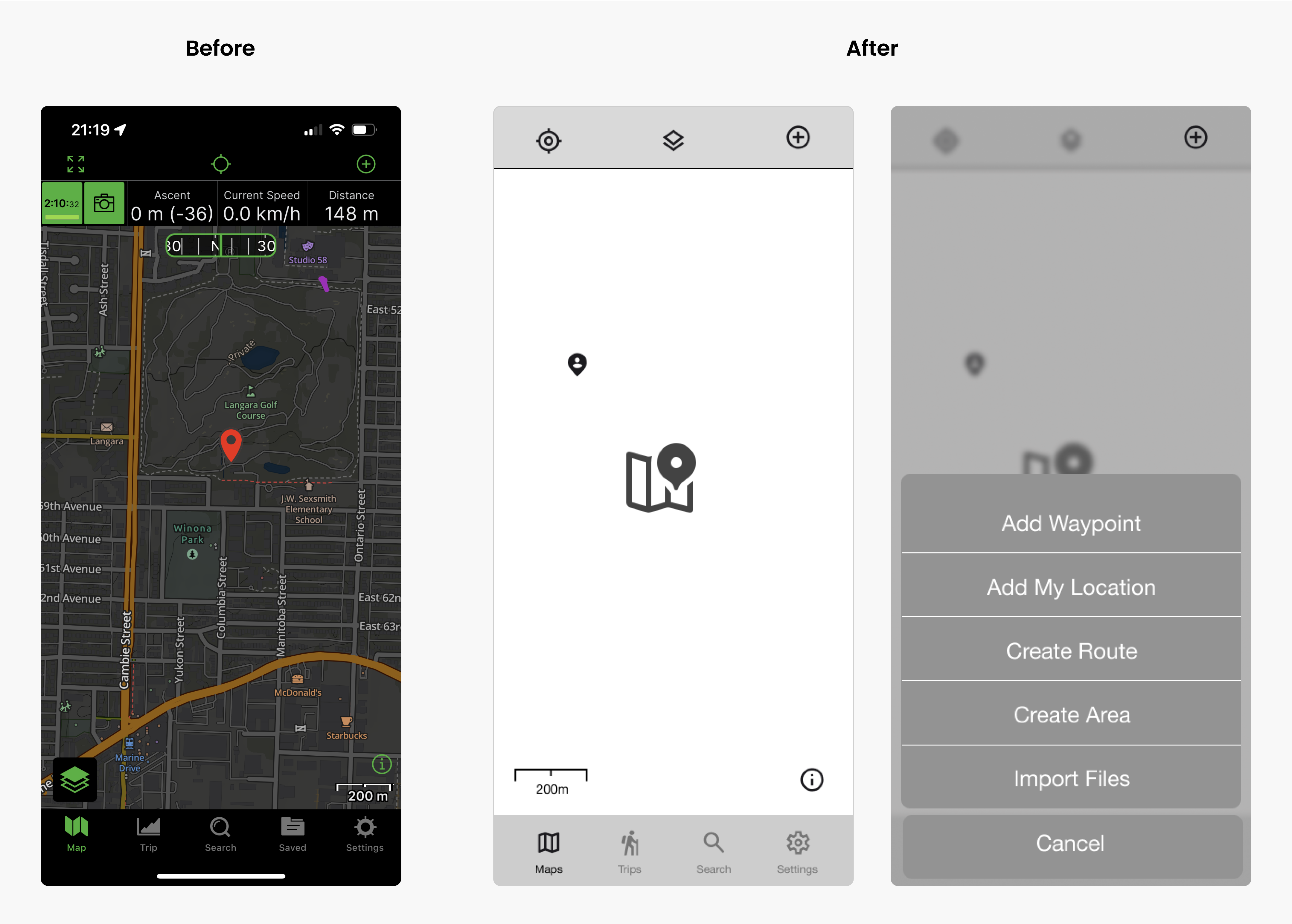
I merged Saved and Maps because, in the existing navigation, these two sections all have the same 'Saved Items" but almost identical functions. Doing this can reduce users' confusion when they see the same things in two different areas. In your current location: Click the icon, which will show the geolocation information of the current location.
Saved Items
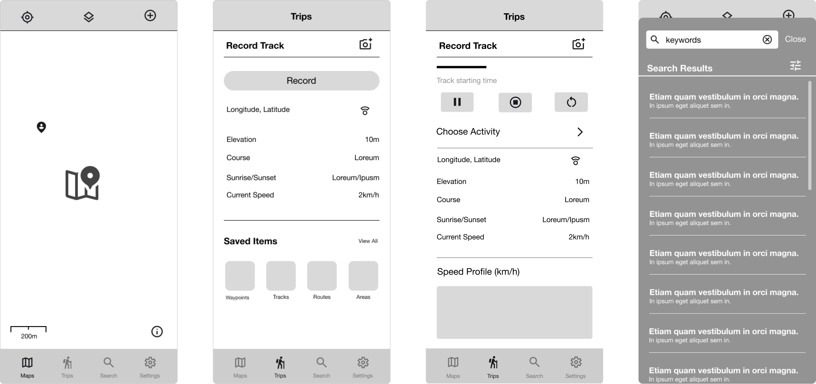
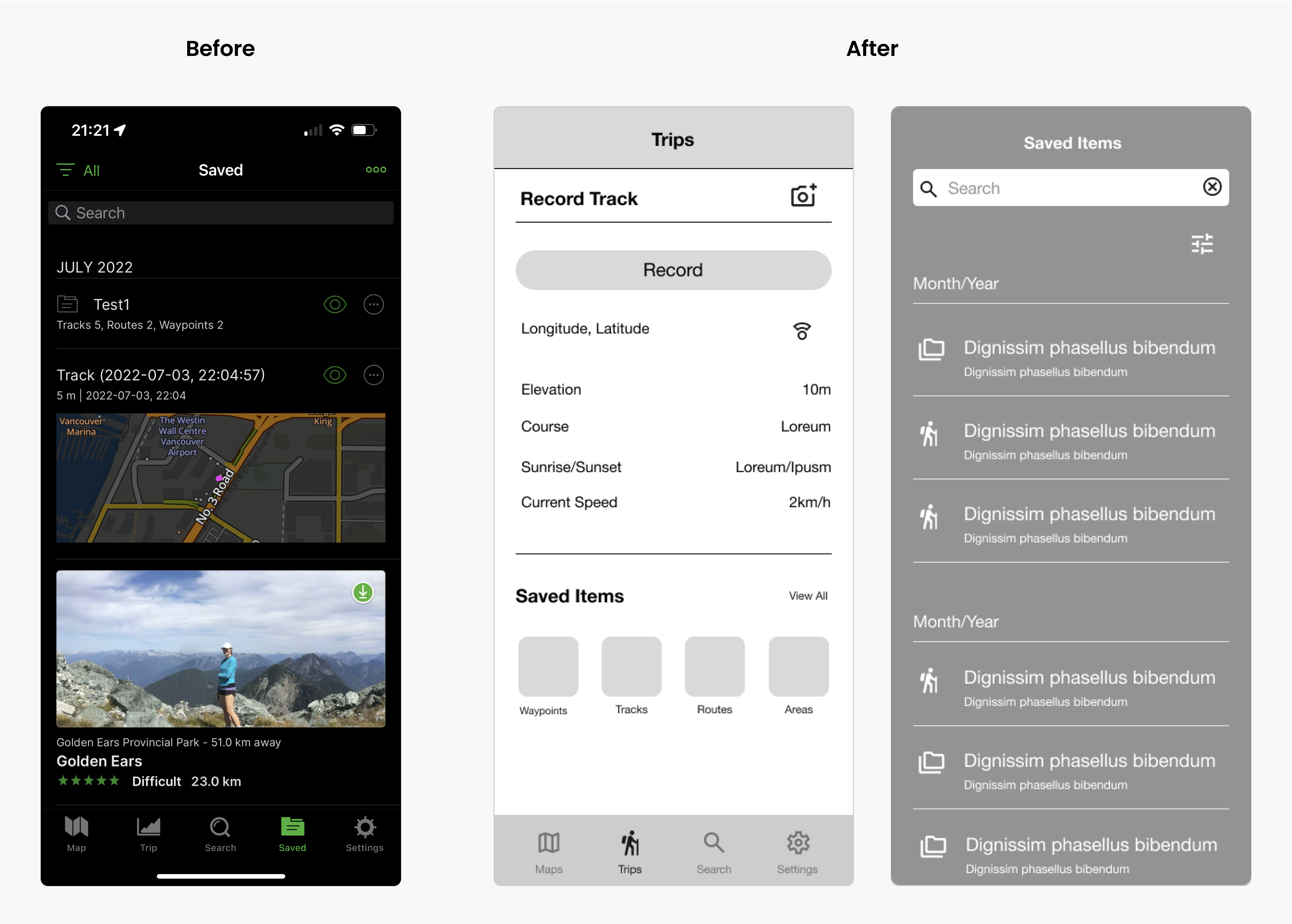
Instead of having an individual section, saved items will merge into Trips - My Places. In "Trips," users can record a track, take pictures of the tracks, and see the trails, routes, and areas they have saved. By filtering, users can find their saved items more accurately and quickly. I removed the icons for visible or invisible and viewed more. So if a user wants to edit or view the detail of this item, they need to click the item and enter it into the detail page.
Trips
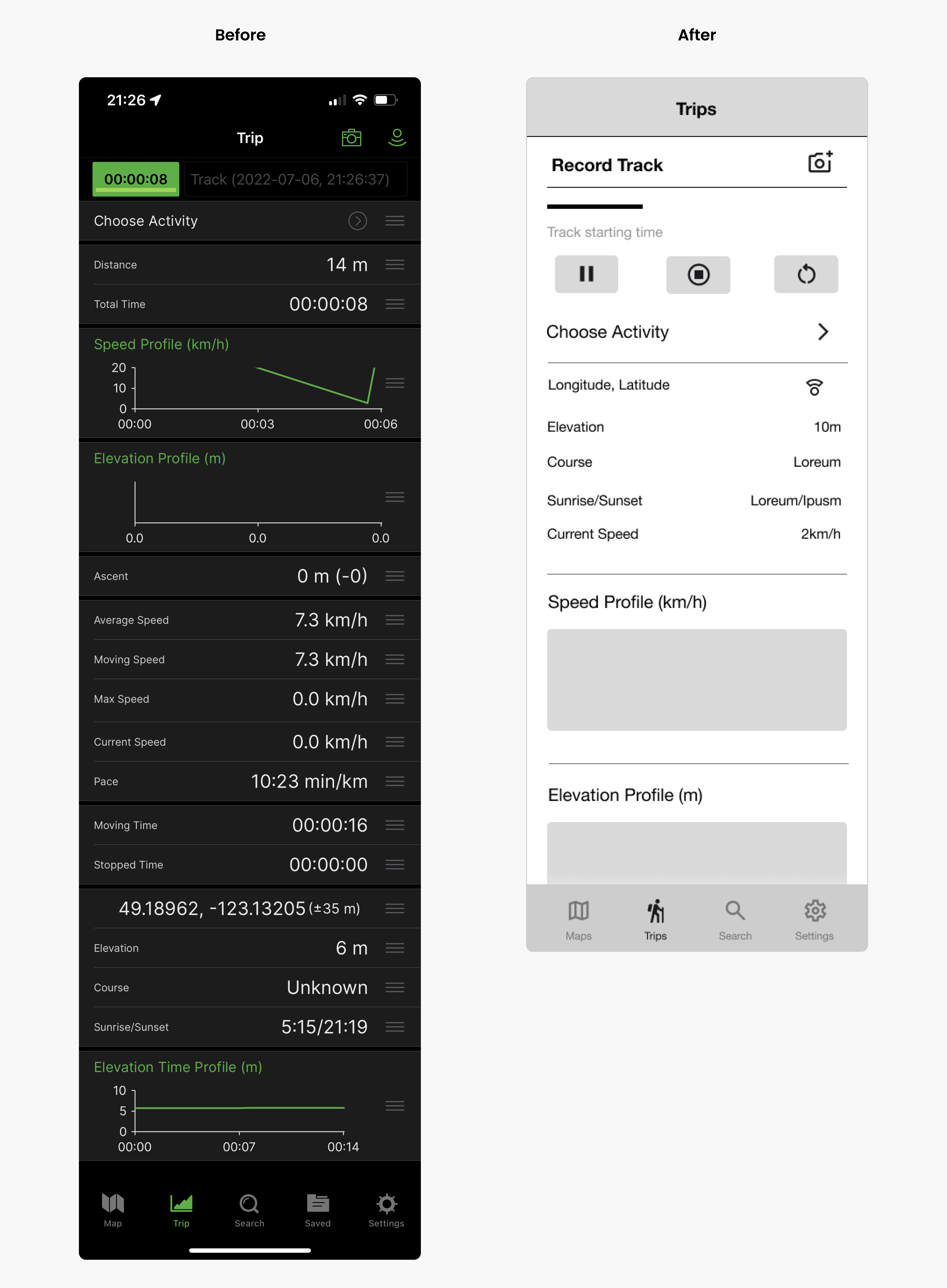
I used icons instead of clicking on the record time to pause or cancel the record to make the user experience more intuitive. The user is presented with options for various activities by clicking on Select Activity. Select the activity in progress, and the recorded data will be adjusted accordingly.
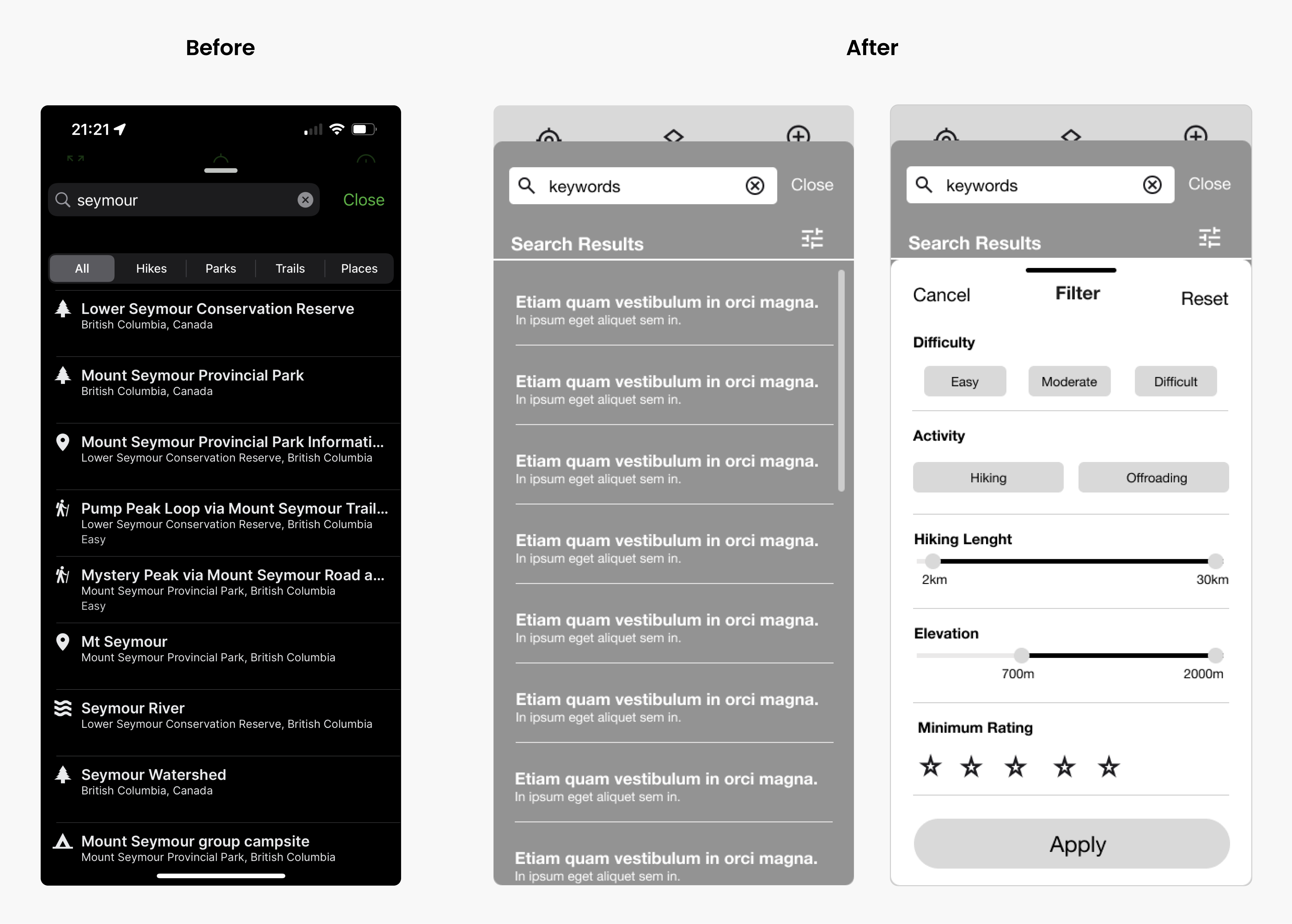
Search Result
The filter function is also provided in the search results, making it easier for users to find the correct route for their activities and enhancing the function's consistency. I removed icons that make users feel confused, and only the search results for keywords were displayed to avoid unnecessary misunderstandings. Secondly, these icons did not appear on the previous search page either.
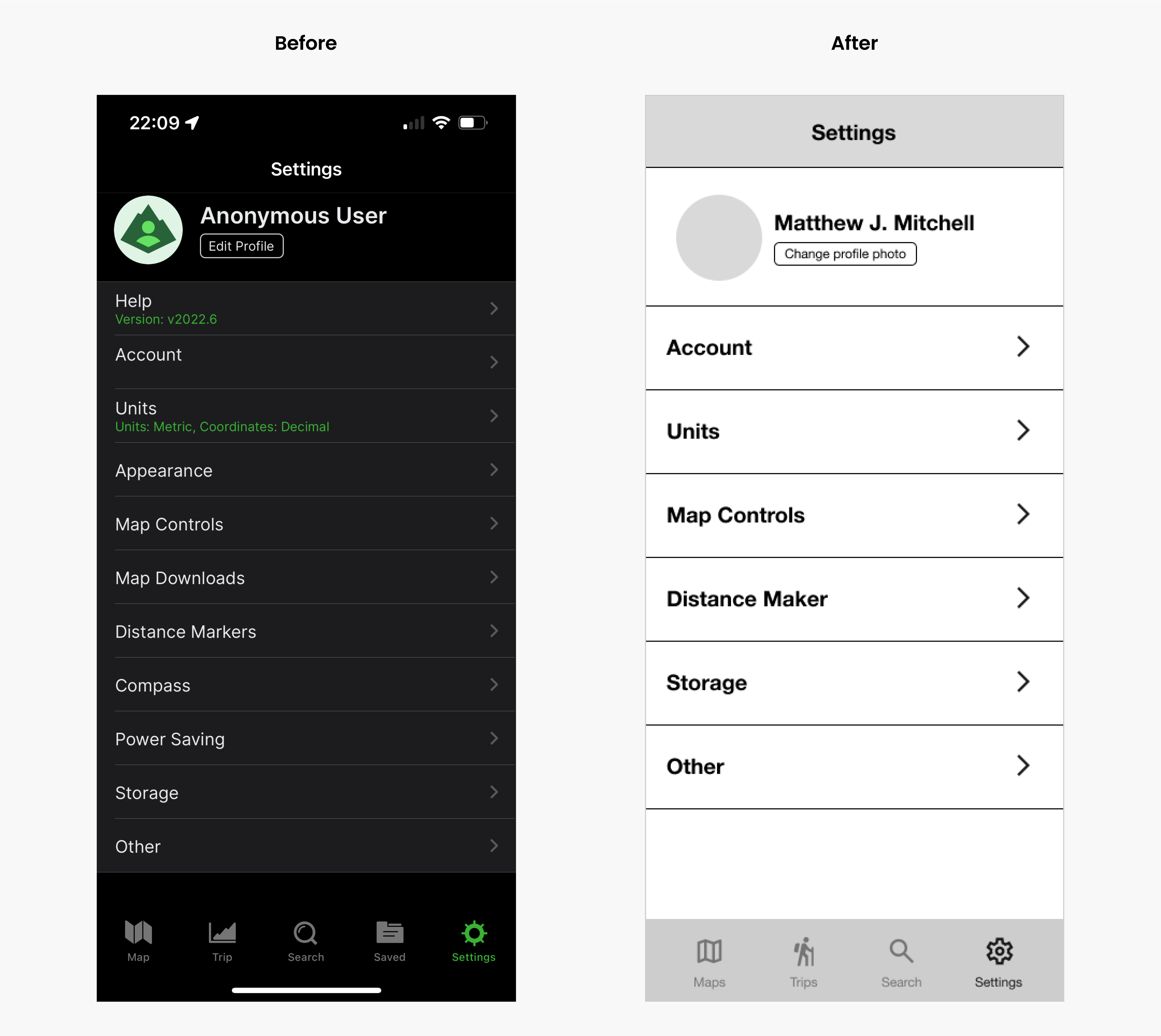
Settings
Also, I replaced the edit message button with a change user photo, as active users change their avatars more often, providing a quick solution for the target user. I merged Edit Profile, Appearance to Account, This is because the content in these options is of the same kind. This not only meets the needs of most usage scenarios, but also reduces the time users spend searching for a particular setting. I also merged all map-related content to reduce user search time and increase users' success rate in changing relevant settings. Remove the Help because there was nothing in it.
Tools Used


